OmniFocus for iPhone 2.0
Today the Omni Group released OmniFocus for iPhone, version 2. I’ve been in the beta and using my iPhone, nearly exclusively, for the past weeks to manage my OmniFocus data. Today the new version is available for purchase and I wanted to share my thoughts following a few weeks of intensive use.
THE Redesign
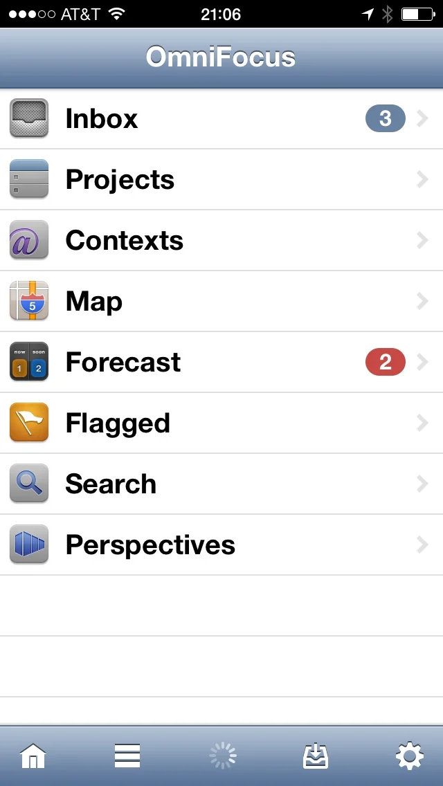
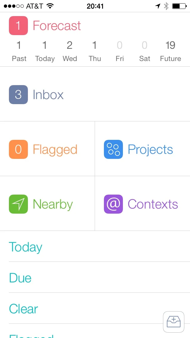
Version 2 has a ground-up redesign. The Omni Group put every aspect of the app under the microscope and produced something quite different from the original. The new version looks nothing like the old version. Don’t believe me? Take a look at the home screens for version 1 and version 2.
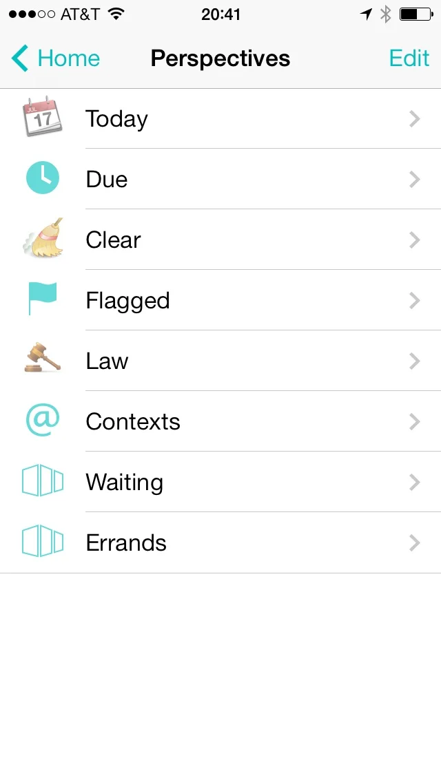
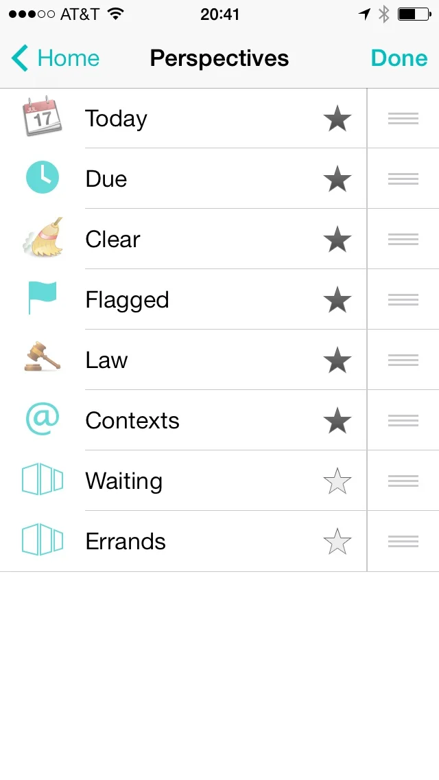
The new start up screen puts everything you need on one iOS 7-friendly screen. Forecast is across the top of the screen along with a live count of due items for each of the next seven days. There are also large buttons on the home screen for the Inbox (including an inbox count), Flagged items (also with a count), Projects, Nearby, and Contexts. Finally there is a list of perspectives at the bottom of the screen. Like before, you can star individual perspectives and they will show up on this screen and you can access all perspectives by tapping on the Perspectives button. (You can also set the order in which they display.)
When you select an item, like tapping the Projects button, the screen splits at the button you select and animates the two halves to the top and bottom of the screen displaying your selected view. The animation is a nice touch and fast enough that it doesn’t feel a hinderance.
Missing from the interface is the big plus sign to add a new task. Instead, there is a floating Inbox button in the lower right corner of the screen that is nearly always present. Tap that button to add a task from just about anywhere.
Also missing from the home screen are buttons to sync my data, adjust settings, and search my database. To get these, drag the screen down, like you do to get the search bar in the iOS 7 Springboard or update just about every Twitter app on the platform. This displays a grey bar across the top of the screen with all of these options. The new design does a great job of just showing you what you need 90% of the time and placing the other stuff in easy reach.
One of my favorite features is the forecast view right across the top of the screen. The new version gives a summary listing the per-day deadlines right on the home screen. I can tap on any day and see all tasks due that day and all tasks I’ve deferred to that day. This view also has all calendar items for that day. Pulling down for the toolbar in Forecast view, the Settings icon is replaced with the View icon. From there you can customize the Forecast view for due and deferred items, and specify which calendars appear. Forecast is one of OmniFocus’s premier features and I’m glad to see it get so much prominence in the new application.
Selecting Projects or Contexts gives a list of Project folders or Contexts with a visual representation of the number of items represented as dots. Tapping these drills down into sub folders or contexts until it hits a list of tasks. If there is anything over due (or nearly due) in any list, the grey dot is replaced with a red or yellow one. This is a great way to get a handle on how you’ve got your work spread out.
The way in which the new application displays lists of tasks also received an overhaul. The Navigation bar at the top uses iOS 7-style text “buttons” to navigate. Tasks are displayed in black text on a white screen, always. Each task displays its project name in grey below. Instead of check boxes there are now check circles. The circles do more than just give you a place to check something off. They also convey information about the task. If there is an ellipses inside check circle, it is a repeating task. If the check circle is red, the task is overdue. The date (or time) that the task became overdue is also listed in red. If the check circle is in yellow, the task is about to become due. In that case, the date (or time) it will become due is listed in yellow. The way it uses colors on the check circles instead of the task names makes a lot of sense. It makes the text more readable while conveying the same information. It also provides for a more subdued interface, which I prefer.
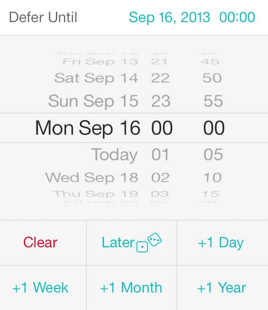
The task edit window is also completely new and iOS 7-ified. There are tap-able areas to adjust the project, context, and add a flag. You can set set due and defer dates. Gone is the term “start date” replaced with the term “defer until” which makes more sense with the way I’ve been advocating using start dates for years.
You can also set a task as repeating, move a task, convert it into a project, share, and delete a task from this screen. Several of these options are new to version 2. Notes and Attachments (both pictures and audio recordings) are accessed through text buttons at the top of the list.
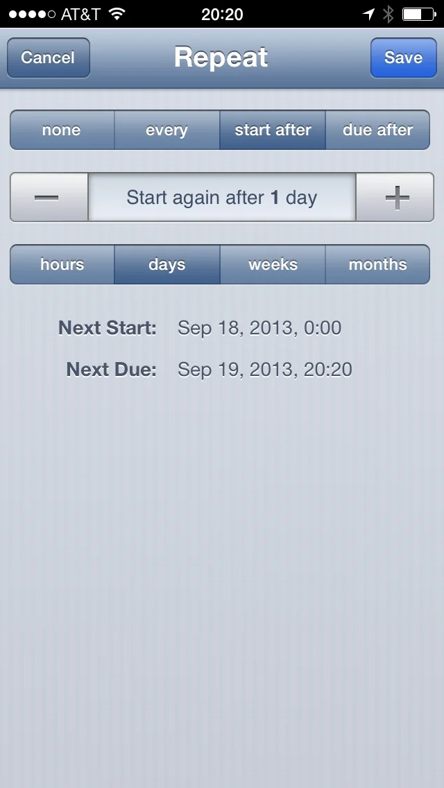
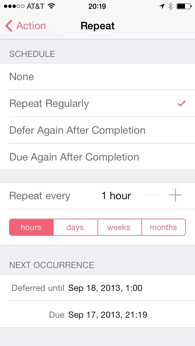
As you dig through these options, you’ll see that everything got redesigned. Take the repeat task screen for instance. The new design simply could not exist on a pre-retina iPhone but looks great on my iPhone 5.
Features
The new version 2 isn’t just a pretty face. There are also some nice feature upgrades.
Background Sync
When Apple first announced they were putting a background sync mechanism in iOS 7, the first thought that crossed my mind was “OmniFocus Sync”. The new version delivers on this. Background Sync allows OmniFocus for iPhone to hit the OmniSync server and pull down updated tasks while OmniFocus isn’t the active application. No longer do I need to launch the app and wait for it to connect to the Internet and pull data down. Occasionally, I’ll get an “optimizing” message (which deals with processing already downloaded data and database changes) but usually I just open the application and go. Background Sync isn’t a setting in the new app. It just happens.
Defer Until “Later”
One of my favorite new little touches is when deferring tasks. Sometimes it makes sense to move a task a day or a week or a month. Other times I just want to put a task (or project) out to some time in the future and stop thinking about it for awhile. There is now an option to defer an action until “later”. The selection even includes a pair of dice. Tapping this moves a task about a month or two (it’s random) and gets the task or project off my mind until then. The random element of this pushes a button I didn’t know I had and I use this feature more than I probably should.
The Price
This is a new version and it requires a new purchase. The price is $20 and, famously, the Omni Group (or any iOS developer for that matter) cannot offer an upgrade price to existing users. I’ve already seen complaints on Twitter about paying for version 2. The logic goes something like this: 1. I paid a lot for version 1; 2. Therefore I shouldn’t have to pay again, ever.
The Omni Group is one of the few companies that has held the line about pricing its software. If you’ve ever owned any of their applications, you probably have a good idea why. The Omni Group is a big software developer with lots of smart engineers, artists, and all the other people required to make something of quality. Moreover, the Omni Group has outstanding customer support. You can call them and get a friendly, knowledgeable human.
This sort of infrastructure costs money. It doesn’t just cost money the first day you buy your app. It costs money month after month and year after year. I remember what it was like having an iPhone without OmniFocus and I don’t care to go back.
I’m pretty sure I paid $25 for OmniFocus for iPhone version 1. That was five years ago. Over the past five years I’ve used the heck out of this app (which ended up costing me $5 per year to own). For the price of one cup of coffee per year I’m more productive and kicking ass with this application. Moreover, the Omni Group did not hold back on updates to version 1. During those 5 years, syncing got really great, OmniFocus became location aware, the Omni Group added an innovative forecasting feature, OmniFocus learned to talk to Siri, the Omni Group built an entire back-end syncing engine for my data, and OmniFocus obtained the ability to add tasks via email. The list goes on. I believe over the next five years, the Omni Group will be just as productive and add more useful features to version 2 that will become equally essential to me.
To those complaining about the price I’d ask you to look back and honestly answer the question of whether the Omni Group hasn’t already given you your money’s worth with version 1. If we, as discriminating users, want to continue to have excellent software, we are going to have to pay excellent developers so they can buy shoes, beer, and Pop Tarts. If you’re really hung up on this, think of it as an extended software license to get you through several more years.
Today I paid $20 and bought OmniFocus for my iPhone without blinking. I’m not trying to be heavy handed about this but we all have an interest in a software model for productivity apps that involves paying an honest price for honestly good software.
Summary
There’s been a lot of speculation that the uniform nature of Apple’s own iOS 7 apps foretold a future where all apps look the same. OmniFocus 2 disproves this. This app does look distinctly iOS 7 but at the same time, is quite noticeably different from the Apple applications. In summary, this redesign reflects a developer that used its own product for several years. It removes friction from the previous design and gives the user something that just flows easier. I’m looking forward to several more years of OmniFocus on my iPhone.
