Fantastical on My Wrist
Today was meeting day. I drove all over southern California meeting with clients. As it turns out, today was also Fantastical for Apple Watch day.
Flexibits just recently updated Fantastical (App Store)(Website) for iPhone including Apple Watch support and in my travels today I got to use the new Fantastical for Watch App under fire. I like it.
Better Glance
The Apple Calendar glance view feels odd on the Apple Watch. It displays your next event as a block calendar entry with a lot of pixels devoted to drawing the “card” around the text, making the text smaller and the view less attractive.
Fantastical removes the card paradigm and instead gives you a count-down to your next appointment in large text with the event name underneath in slightly smaller text. There is also a view across the top showing your events for the day graphically. Fantastical’s glance view seems more native on the Apple Watch than Apple’s Calendar app.
Apple Calendar on left. Fantastical on right.
Better Appointment List
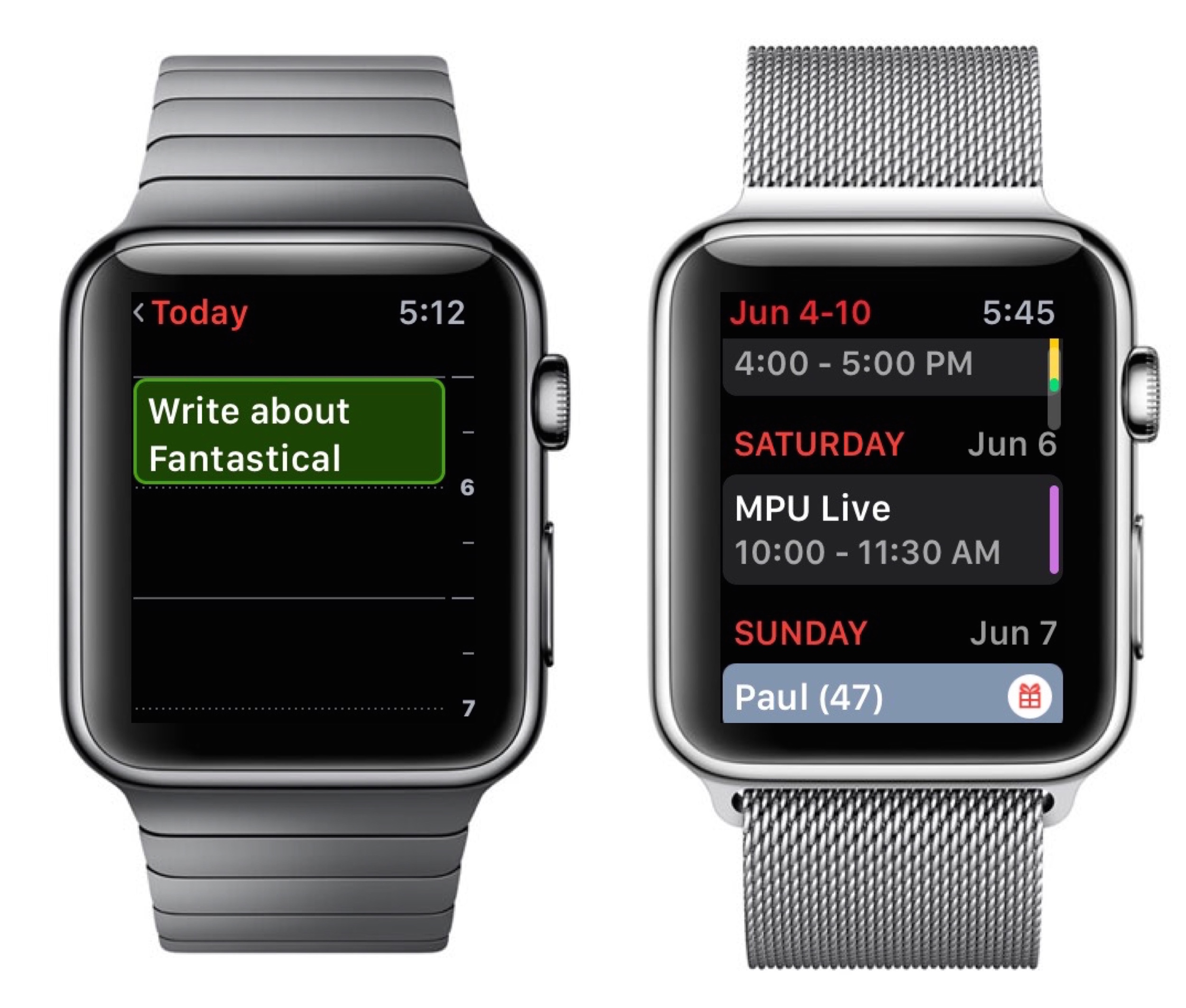
Moving in to the Fantastical App, it follows a lot of the same principles as Fantastical’s iPhone App’s with a list of all upcoming events scrollable with your finger or the digital crown. Fantastical does a bang-up job of displaying event lists on all platforms. The Apple Watch is no different.
The Apple Calendar app does something similar but instead of a list view, it draws your events on a long scrolling view that includes all the blank areas where there are no events. Using Apple Calendar, if you have a meeting in the morning and nothing else until the next day, you’ll have a whole ‘lotta scrollin’ to see what’s up the following day.
In my mind there is no question between these two implementations. Fantastical’s is better by a long shot.
Update: @JeffCarlson points out Apple Calendar will do a list view following a force touch. I'd still argue that should be default behavior.
Apple Calendar on left. Fantastical on right.
Reminders
I’m still scratching my head on how the Apple Watch shipped without an app to view reminders. We use the Apple Reminders app in our house for several shared lists. Looking at these on my list while I’m in the grocery store makes perfect sense. Now I can see (and check off) reminders on my Apple Watch with the Reminders support in Fantastical.
Force Touch For Event Creation
While in Fantastical you can create new events by tapping on the screen and dictating the event. You can even use the Fanstical syntax. For instance, saying “Write Blog Post about Fantastical at 6pm alarm 15 Slash MS” created an event at 6pm with an alarm 15 minutes earlier and put it in my MacSparky calendar. (If that last bit sounds like sorcery, watch these videos.) One issue with this is that the Apple Watch likes to turn itself off and sometimes does it right in the middle of event creation, which is a drag.
Overall, I prefer the Fantastical interface and design on the Apple Watch over the built-in Apple Calendar application. It does a better job of giving me the calendar and reminder information I need.
The only down side is that Fantastical is not a native app on the Apple Watch. It has to connect with my iPhone to get its data and sometimes you’ve got to watch the spinning animation while it does so. Hopefully we get news of that changing next week at WWDC.


