A Mac Nerd Spends 30 Minutes with the Microsoft Surface Studio
A few days ago my wife needed to go to the mall and to her surprise I asked to go with her. My destination was, for the very first time in my life, the Microsoft Store. Specifically, I wanted to check out the Surface Studio, Microsoft's innovative new PC that looks like an iMac but also tilts down to resemble a drafting table to take advantage of Microsoft Windows' touch computing features.
It was a Saturday and the Microsoft Store was more crowded than I've seen it before. The only time I'd been in this store in the past was to take phone calls because, historically, it is the quietest place in the mall. However, between the virtual reality demonstration and the growing Microsoft PC lines, the store was busy.
A Computer that Tilts
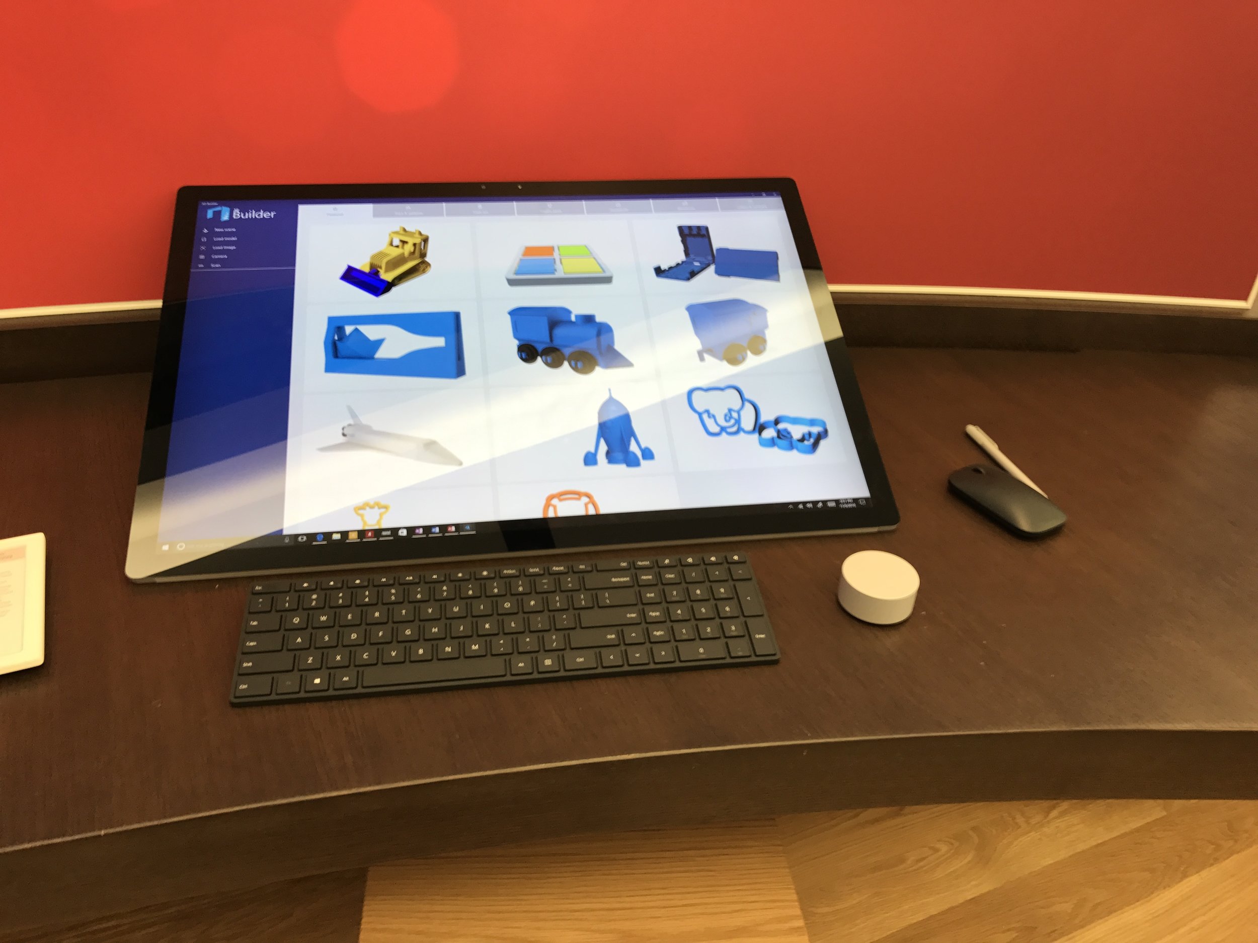
When I stood in front of the Surface Studio it was configured as a traditional computer so the first thing I did was pull it down to drafting table mode. The springs are nicely tuned and you can easily adjust the screen with one hand. There is a stylus that attaches magnetically to the side of the computer along with a minimalist keyboard and mouse.
That adjustment is the big selling point of this computer and if you want a computer that suddenly feels more like a super-big iPad, the Surface Studio delivers, mechanically at least.
I've been doing some screencast projects lately that involve time in Windows 10 and while it's a lot better than Windows 8, it's still Windows. I'm not trying to bait Windows fans but I have spent time in both operating systems and genuinely prefer macOS (and macOS software developers) over Windows. I'm not the least bit tempted to switch, even for a fancy tilting computer. My real curiosity, however was how well the Surface Studio would work in drafting mode using Microsoft's one-operating-system-to-do-everything approach, which I recently wrote about.
Overall, the Windows 10 and the drafting table computer work as Microsoft intended. You can select menu items and make selections with your finger but you have to be deliberate and careful. Most of Windows was designed with the idea that you'd have a one pixel sized mouse pointer. In this context, my finger was a blunt instrument and several times Windows mis-read my true touch target. This wasn't an issue in dialog boxes with white space around the selections but a definite problem anytime I worked in an information-dense area, like menus. In the pre-installed drawing and 3D apps, everything worked well and the apps were definitely tuned for touch. If I paid for my shoes making art on a computer, I'd be very interested in the Surface Studio, Windows 10 warts and all.
In more traditional apps, like Microsoft Word, the touch interface was less useful and more wonky. Word is way more touch-friendly on iPad than the Surface Studio. Those two teams at Microsoft should have lunch together once in awhile, Microsoft is clearly invested in making touch work in Windows and this is a big step but they still have a ways to go.
About that Dial
Another innovation with the Surface Studio is the Surface Dial, a large twisty knob similar to my old Griffin PowerMate. The Surface Dial is both a twist knob and a button. You can set the Surface Dial on the desk or, interestingly, put it on the screen for different features.
In terms of build quality, the Griffen PowerMate is heavier and more solid. (While the Surface Studio itself appears well-built, all of the peripherals felt like they were missing a little heft.) Because the Surface Dial is wired into the Windows operating system the Surface Dial could become something really interesting. I had the Microsoft employee show me some of its features and at this point it’s pretty limited. We got it to work as a volume dial and a zoom dial in a 3D application. In Microsoft word, spinning the dial acts as an Undo. I felt like it should do more. Hopefully they’ll be working on this between now and when the computer ships next month.
Performance Lags
The biggest problem with the Surface Studio was getting it to keep up with graphics intensive interface operations. Apple's put a lot of effort in both iOS and macOS making the interface pop when you move things around. Pinching and zooming with my fingers on the Surface Studio (when available) was bad. When I tried this, the screen was non- responsive for a moment and then jumped to the screen being bigger or smaller. The frame rate was effectively reduced to one frame per second or two. The Surface Studio hasn't shipped yet and I'm guessing Microsoft is working on fixing this, but this lag reminded me that Windows as a touch operating system, still is pretty wobbly.
Happy Nerds
I'm clearly not the ideal customer for the Surface Studio. Even if it were running macOS, I'm still not sure how much I'd use a drafting table Mac. macOS and, realistically, Windows are not very touch friendly at this point. Nevertheless, the Surface Studio is different in a good way and I'm glad to see Microsoft innovating again. I think the Surface Studio still needs work but I can see this form factor becoming a favorite for creative folks and I'm really curious to see if Microsoft gives the Surface Studio everything it needs to succeed. If anything, this makes me think of a really big iPad in a few years and how fun that may be.
The best part of my road trip to the Microsoft Store was observing fellow nerds. After spending about 30 minutes putting the Surface Studio through its paces I realized there were three people waiting behind me to try it out. There were a lot of Windows enthusiasts there ready to check out the Surface Studio and they were excited. The vibe was similar the one I felt while standing in line for the first iPhone. That can only be good for Microsoft and Windows fans.


