My iPhone Home Screen, 2018 Edition
It’s been awhile since I shared my home screen and since I finally shipped my iPhone Field Guide, this seemed the right time to share my iPhone home screen, 2018 edition.
Since getting the iPhone X, I’m still in love with the OLED display. I like it so much that I’ve been keeping a pure black background on my home screen since the iPhone X first released.
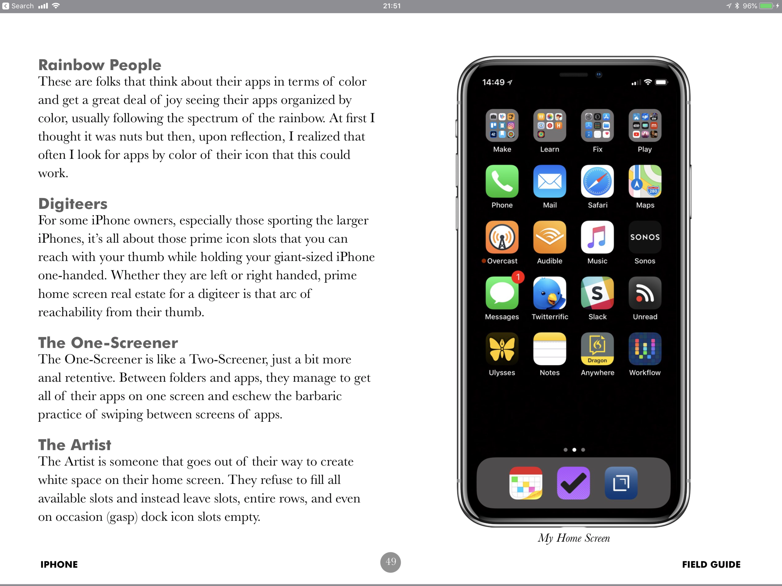
The top row is my folders of apps. I’ve been using this system for some time, and I still think it’s the best, at least for me. Each folder has a verb for its name: Make, Learn, Fix, Play. Any app that doesn’t make the home screen cut goes into one of these folders. I just ask myself what I’d do with the app and put it in the appropriate folder. I use Siri or Spotlight to find most apps, not on the home screen but having this rough sort helps. I also really like keeping my phone to just one screen.
The second row has some Apple Fundamentals: Phone, Mail, Safari, and Maps.
Occasionally I swap out the Mail app for a third party client like Spark or AirMail. The trouble is, they are never quite as stable for me as Apple Mail, so I usually end up going back.
Likewise, when I travel outside of California, I’ll often replace Apple Maps with Google Maps, but Apple Maps works for me in California.
The next row includes my essential audio apps: Overcast, Audible, Music, and Sonos.
In the past several months I’ve tried out several alternatives to Overcast just to see what’s out there. I wanted the Apple Podcast app to work because I love the idea of kicking off podcasts with my voice, but that was a bust. Moreover, Overcast keeps getting better. The latest update rewinds the podcast a few seconds any time you pause or stop, which helps me get back into the swing and I like the way Overcast works with CarPlay.
I’ve been a subscriber to Audible for years, and I used to keep the app in a folder but moved it to the home screen this year, and I think it will stay. Finally is Sonos. I’m hoping that AirPlay 2 will allow me to easily stream to Sonos from the Apple Music App. As much as I like my Sonos speakers, I’m not a big fan of the Sonos app.
The fourth row has my social apps: Messages Twitterific, Slack, and Unread.
I switched from TweetBot to Twitterific in December, and I like it. I’m not sure it’s better than TweetBot, but I was ready for a change. This week in response to the Twitter’s threatened further moves against third-party apps, I tried to use the official Twitter app for a few days. Ugh. Twitter is definitely a better experience with third-party apps. Slack is home screen worthy and Unread remains my favorite RSS app.
The fifth row includes productivity apps: Ulysses, Notes, Dragon Anywhere, Workflow.
When I first put Ulysses on my home screen, it was just an experiment, but I find myself opening the app and writing in it often. I’ve flirted with Bear, but Apple Notes still is my place for reference notes. Dragon Anywhere and I are at a difficult point right now. Some days it works amazingly well. Other days it doesn’t. With a $15/month subscription, I feel like it should be more consistent. Nevertheless, it remains on the home screen.
And then there’s Workflow. My beloved.
Interestingly, my dock has all third-party apps in it: Fantastical, Drafts, and OmniFocus
Fantastical runs circles around the native calendar app. I wrote this week about Drafts 5. Finally, I’m running the beta of OmniFocus 3 and digging it. I’ll be posting more on that next week.
I also find apps through the Today View. The Siri recommendations are pretty good. I’ve been using Headspace lately, and I’ve even given it the right to give me limited notifications. Because I normally meditate at the same, it gives me an appropriate notification at the right time to get mindful and I don’t have to dig for the app.
What I'd Change
I often ask home screen guests about the one thing they would change about the iPhone if they were in charge. I’ve got a few.
First, I’d do whatever it takes to make Siri work better, faster, and more consistently. Siri is a great idea that needs better execution, now.
Next, I’d open the iPhone up more to allow users to change default apps, for instance substituting Chrome for Safari. I’d also put in place whatever resources are necessary to make the Workflow-as-part-of-iOS project awesome and the envy of all non-iPhone users.
My Apple Watch
For a hyper-scheduler such as myself, the Siri watch face is ideal. A lot of people don’t realize it, but you can turn on and off individual components of the Siri watch face to make it work for you. I'm using Drafts as my single complication because it’s so damn handy.
My Lock Screen
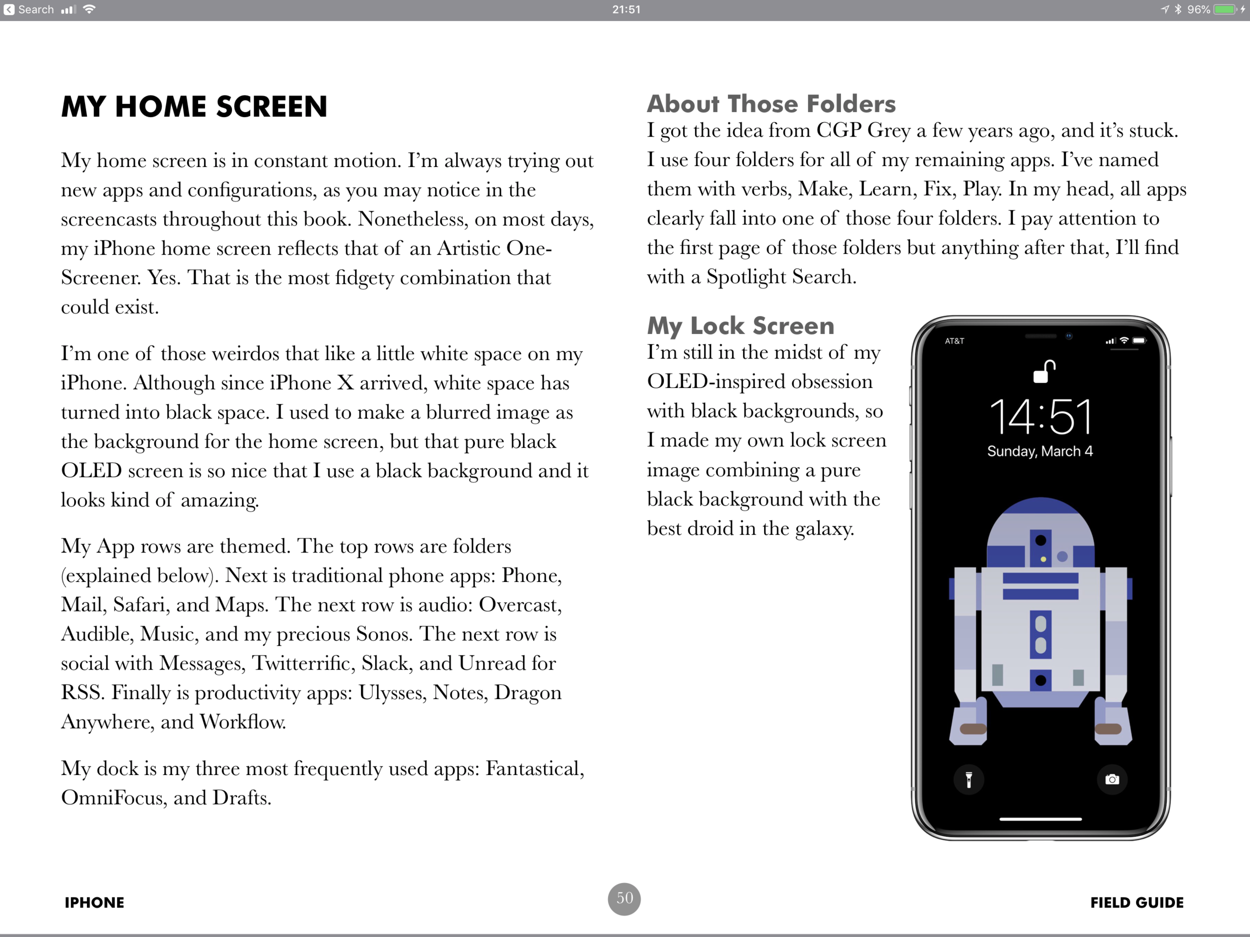
I’ve currently got a home-made inspirational quote lock screen. That’s not usually my thing but someone made this wallpaper from a Merlin Mann quote years ago and it does inspire me. The trouble with the above-linked wallpaper is that it is too hard to read with 50-year-old eyeballs so made my own version and spread on the Futura Bold extra thick.
That Blank Space
I like having empty space on my iPhone home screen. A lot of people think its nuts, but I like the way it looks and should we like the way our stuff looks?
And a Shameless Plug
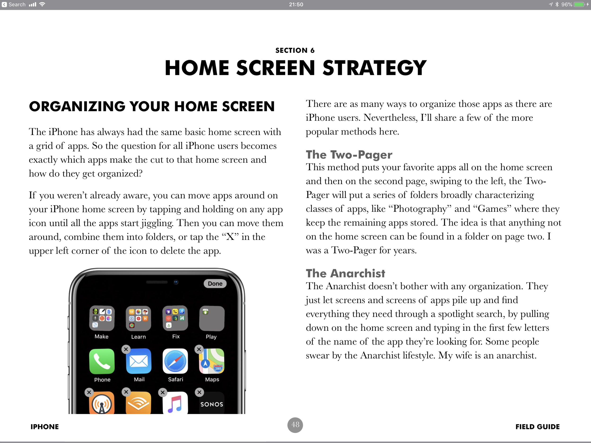
I did a whole section in the iPhone Field Guide on Home Screen layout. I’ve shared several of the pages below. It’s fun reading, and maybe it’ll even tempt you to check out the whole book. Enjoy.


