In Defense of iWork

The general consensus since the 2013 update to the iWork suite for Mac (Pages, Numbers, and Keynote) is that it’s useless, or nearly so. I’ve heard this from a lot of geek friends. Nevertheless, I keep using the suite to get work done. 

As a little bit of history, the last major update to iWork on the Mac before 2013 was 2009. It is now clear the Mac version was given a backseat while the iWork team developed the apps for the iPad, and then the iPhone.

In hindsight, I suspect it was not that they were ignoring the Mac apps so much as they were pedaling hard on the iPad and iPhone versions and they realized that in order to make them work best with the Mac, the Mac versions were also going to require major re-writes to bring them in line.

That’s exactly what they did with the 2013 updates. While the iWork suite then had a shared code base between the Mac, iPhone, and iPad, that parity required several feature sacrifices on the alter of compatibility.

In 2013, iWork users weren’t happy. Out of character, Apple publicly explained. Now that Apple had everything on the same code base, they would start building back features that were left behind. Apple has made good on that promise with a steady release of updates, each bringing back old features and adding a few new ones. As things stand today, the Mac iWork apps do not have every feature we had with the 2009 version. There are also still problems including a pretty big one concerning file support, covered recently in the ATP podcast, that prohibits users of the current version to open iWork documents created in older versions before 2009.

Despite these issues, I disagree with the notion that iWork is of little or no value. I use all of the applications frequently to get work done and have come to rely upon them in their new incarnations.

I use Keynote for every presentation. I’d like to think my presentations are pretty fancy and the new version keeps up just fine. At this point you’d have to pull Keynote out of my cold, dead hands.

I also use Numbers every day. I use it to track billing in my day job so at any time I’ve got a Numbers spreadsheet open that gets bigger and bigger as we move through the year. My current billing Spreadsheet has approximately 250 separate sheets with many links and calculations between them. This is not a complicated spreadsheet, but a big one and I rely upon it to sync across my devices. I also have built little app-like spreadsheets that I frequently use in the day job. One of those spreadsheets is a type of database that I use to track documents, facts, and issues in ongoing litigation. Those can get really big and Numbers handles them fine. I also use Numbers to track money, sponsorships, and other details on the MacSparky and Mac Power Users end. Numbers 2013 delivers all of this utility to me. 

Pages is a bit of an oddball for me. I write just about everything in plain text but when it comes to page formatting, I prefer Pages over Word. I think the user interface elements make a lot more sense. I also prefer the way it displays change tracking and I find it more stable. Nonetheless, I work in an industry where everybody uses Word. To the extent I use a word processor, I use Pages for all of my personal stuff and probably about 40% of my day-job stuff.

I know that I am but one user and I also know that if you relied on a feature that simply doesn’t exist anymore, the app will cease to serve its purpose. If, for example, they pulled change tracking out of Pages, I’d have to stop using it entirely for legal stuff. 

My point is that I am somewhat of a power-user and I’ve found, by and large, this new generation of iWork to be up to the task. Moreover because I am that guy that frequently is on the road with an iPad or iPhone, I find the cross-platform sync to be enormously beneficial. It was my inability to sync iWork documents that largely led to my rant against iCloud a few weeks back. (Things have, thankfully, improved for me with the most recent updates.)

If you’ve given up on iWork because you heard how broken it is, I’d encourage you to give it a try. While I'm sure it is not for everyone, I'm equally sure it is the right solution for a lot more people than its rumored demise implies.

The Moving Timeline Keynote Trick

While attending the World Domination Summit I got to finally see (and meet in person) Nancy Duarte. Nancy is a remarkable communicator and helped many high profile clients with presentations, including Al Gore’s An Inconvenient Truth presentation.

During the presentation she did some timelines where the timeline would move while she spoke. During the WGS geek lunch afterward, several people were asking how she did it. I was happy to explain this is a nut I have already cracked. In order to create a timeline that moves, you simply need to make a timeline bigger than a single slide and then stack them next to each other. Then you can use the Push transition to make it appear as if the timeline itself is moving when all you are really doing is transitioning from one slide to the next. For instance I will take the following three slides. Each one represents a small piece of a larger timeline.

When creating this timeline, start out with one slide and get your timeline set exactly where you want it. Then duplicate the slide as many times as you need. If you need to make adjustments to the actual line, be very careful that you don’t move it vertically or it completely ruins the effect. I also usually add a small dot the beginning or ending of the timeline drawn with a keynote graphics element.

Then I will place them next to each other as they will appear in Keynote’s presentation. When assembled this way you can see it looks like one single timeline even though it’s three individual slides.

Screen Shot 2013-07-30 at 8.49.36 PM.png

After that it’s simply a question of setting transitions using the Push animation and setting a reasonable length so the audience can follow with you as the timeline tracks across. If this isn’t making any sense to you, I’ve made a short presentation that you can download here demonstrating the effect.

So many of the tricks I use in Keynote are just hacky little visual tricks like this.


Remotely Advancing iPad Keynote Slides

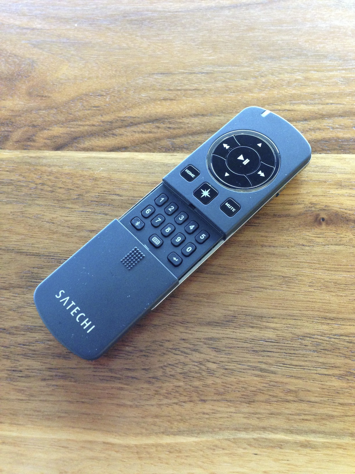
IMG_1104.jpg

Update: January 2015 The Satechi remote does not work with iOS 8. This may no longer be the remote you are looking for.

The last few months I've been giving presentations with my iPad and using a remote to trigger slides. I'm not talking about Apple's Keynote Remote, which feels fiddly to me, but an actual clicker. I push the button and the next slide or animation triggers. It even works with the iPad's dock connector connected to a projector. This means I can now walk in a room with an iPad mini and a remote and give a presentation. When I spoke at the Omni Group event last month, I had several people asking me how I did it. The trick to all of this is the Satechi Bluetooth Smart Pointer Mobile Presenter (Amazon affiliate link).

I paid $45 for mine on Amazon. As a remote, it really isn't anything special. It does have a power slider so you can turn it off and be assured it won't run down the battery in your bag. However, it charges through USB so if it dies, you need to plug it in. (You can't just replace the batteries with a few spare AAs.) The laser is red (I prefer the more visible green.) It is also not particularly ergonomic. The buttons are flush with the surface so you can't always figure out exactly where your thumb is without looking down at the remote. My Kensington remote is better in almost every way except for one: It can't advance iPad Keynote slides. Despite all of issues surrounding the Satechi's design, it finally lets me remotely trigger Keynote slides on my iPad.

The Trick

To make this work, Satechi had to get creative. There is no easy way to tell Keynote via Bluetooth to trigger slides so instead they used the iPad's accessibility features to pull it off. There are few steps:

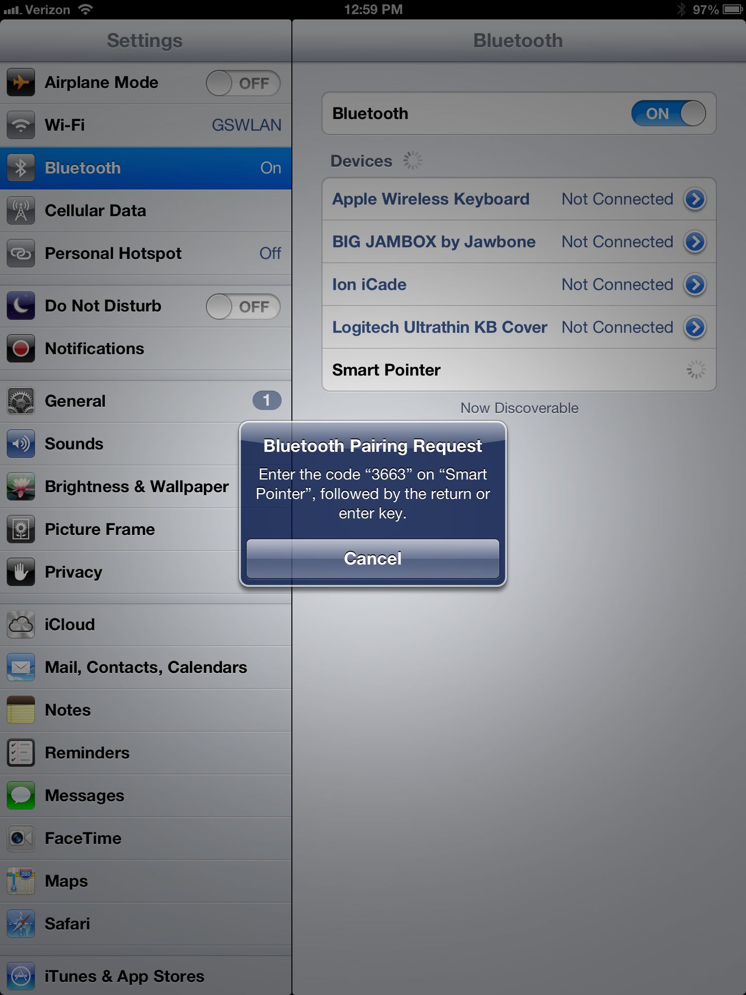
1. Pair the Remote

It is a Bluetooth device and you need to hook it into your iPad. This works just like any other Bluetooth pairing. In this case, a code is entered from a set of numbered buttons found under the Satechi's sliding face.

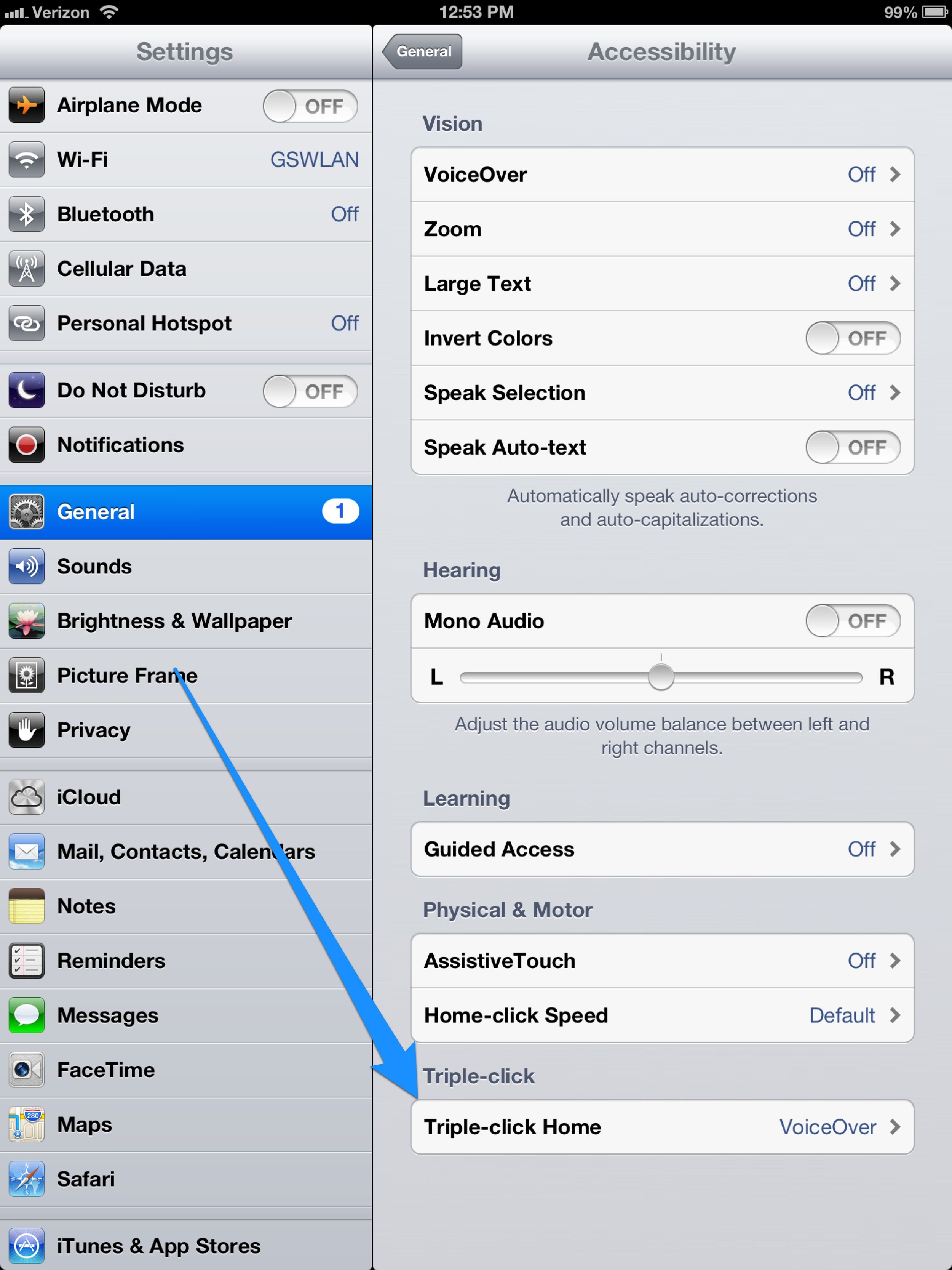
2. Enable VoiceOver

Next you need to enable VoiceOver in the iPad's Accessibility settings. Set it to trigger on a triple click of the iPad's home button but don't enable it yet.

Once that is done, set the remote to "Accessibility Mode" on the slider on the back right side. The other modes are useful for multimedia or using the remote to present with your Mac. I keep it in my bag as a back up for these purposes but so far all I really use this remote for is to present with the iPad.

Now go find your presentation in Keynote on your iPad and open it up. Then triple-click the home button on the iPad to enable VoiceOver. You'll want to turn down your iPad volume at this point.

That's it. Now you can move forward and backward in your presentation with the remote. That has always been a major gripe for me and now it is fixed with this hacky (yet effective) solution.

IMG_1103.jpg