The Apple MagSafe Battery Pack

A few weeks ago, Apple released the MagSafe Battery Pack. The device itself is a small bit of matte rubber covering a 1,460mAh battery that transfers at 5W and the MagSafe-aligned magnets for it to snap on the back of your iPhone.

I bought one thinking I'd try it out, remaining mindful of the two-week return calendar. I ended up keeping it and thought I'd report a few findings here.

The Short Version of this Review

The MagSafe Battery Pack is overpriced but super convenient.

The Killer Feature: Convenience

The only reason to buy the MagSafe Battery Pack is convenience. It is smaller than nearly all battery packs you can buy, and it easily fits in your pocket. It's also convenient because it uses MagSafe to charge, so you don't have to fiddle with a cable. My primary use case for this battery is day trips to Disneyland.

If you haven't been to Disneyland lately, the entire experience now runs off an app. In addition to using the app for your admission ticket, you also use it to make ride reservations, order food, interact with the park, and just about everything else. That's in addition to the inevitable picture-taking, media-sharing, and messaging that comes with visiting Disneyland. So the park puts more drain on your battery now than it ever has in the past.

Historically, I'd plug my phone into a charger while I sat and ate, or (in a jam) do that thing where you've got the battery in one pocket or in your backpack and snaking a cable to the phone somewhere on your person, which in addition to making you look like a dork, is also a pain in the neck when the cable gets snagged while you are moving around.

So I bought the battery for convenience. I want to snap it on my phone around 2 pm and then snap it off a few hours later, knowing I'll have sufficient charge to continue using my phone throughout the day. The MagSafe Battery Pack does that. I've now taken a few trips to Disneyland, and the MagSafe Battery Pack was easy to carry, juice up my phone, and then get out of the way. I no longer need to remember to charge while I eat or deal with the random cable issue.

Also in the convenience category is how it works with the iPhone OS to display the battery and phone charge levels. Third-party batteries will never get hooks into the operating system. Apple batteries will.

The Downside

If the above-listed conveniences aren't blowing your hair back, you should not buy a MagSafe Battery Pack. There are alternative battery packs on the market (even MagSafe ones!) that are cheaper and have more capacity. Indeed, I'm not aware of any other battery on the market that gives you so little bang for so much buck.

It's really simple here. Either you are willing to pay for the conveniences of the MagSafe Battery Pack, or you are not. Neither decision is wrong. Imagine if, instead, we were talking about refrigerators. You can spend anywhere between $300 and $10,000 on a new refrigerator, all of which are perfectly capable of keeping your food cold. It comes down to what features you want. When buying a new refrigerator, I avoid the more expensive conveniences. However, when it comes to my iPhone, I'm willing to pay. That's why I'm keeping the MagSafe Battery Pack. Also, I try not to think of the fact that for the cost of three of these batteries, I could get a new refrigerator.
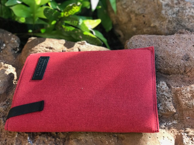
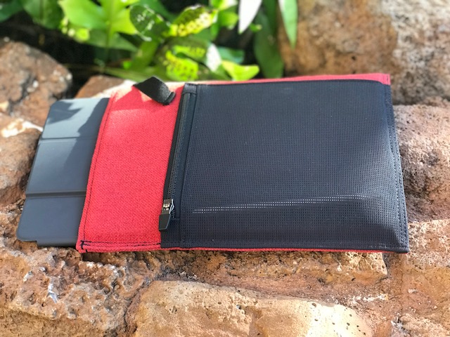
Waterfield's Sutter Tech Sling

Click to enlarge.

While I generally prefer backpacks when carrying a lot of gear, over the past year, my load-out has got a lot smaller. The iPad Pro, with its relatively light weight, is as powerful as a MacBook Pro and I don't have a laptop anymore. Often I want to head out to Starbucks (or Disneyland) with an iPad and a few odds and ends. The gang at WaterField bags were kind enough to send me their new Sutter Tech Sling to try out for just this purpose.

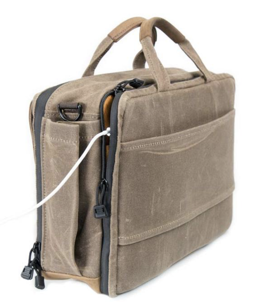
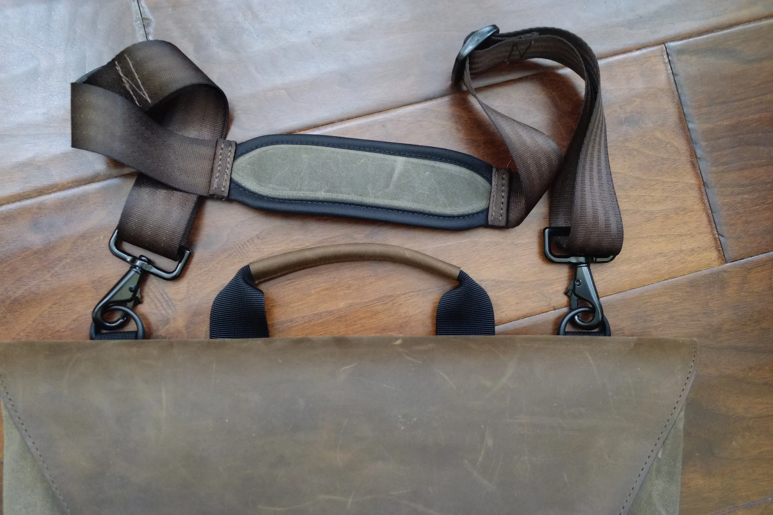
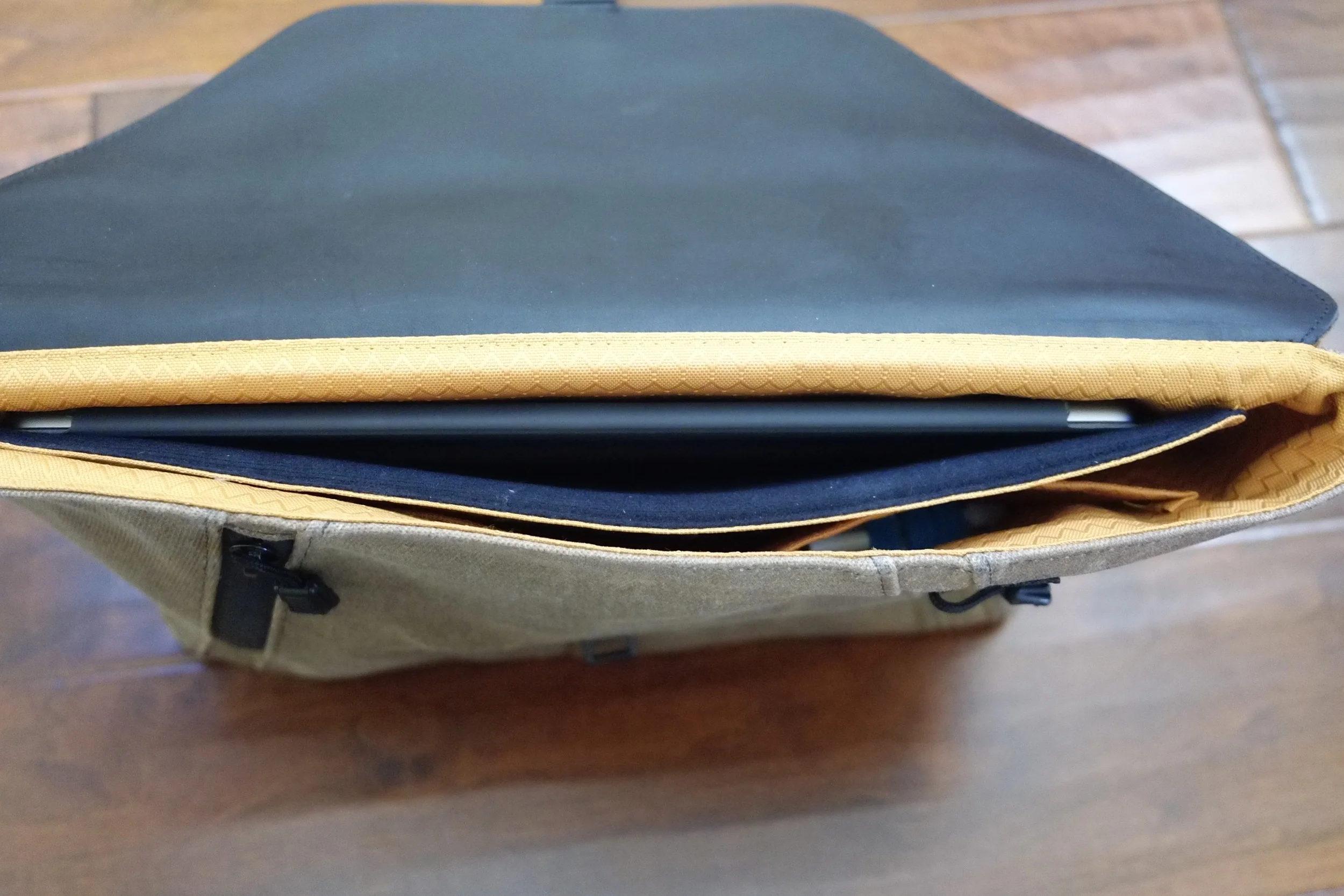
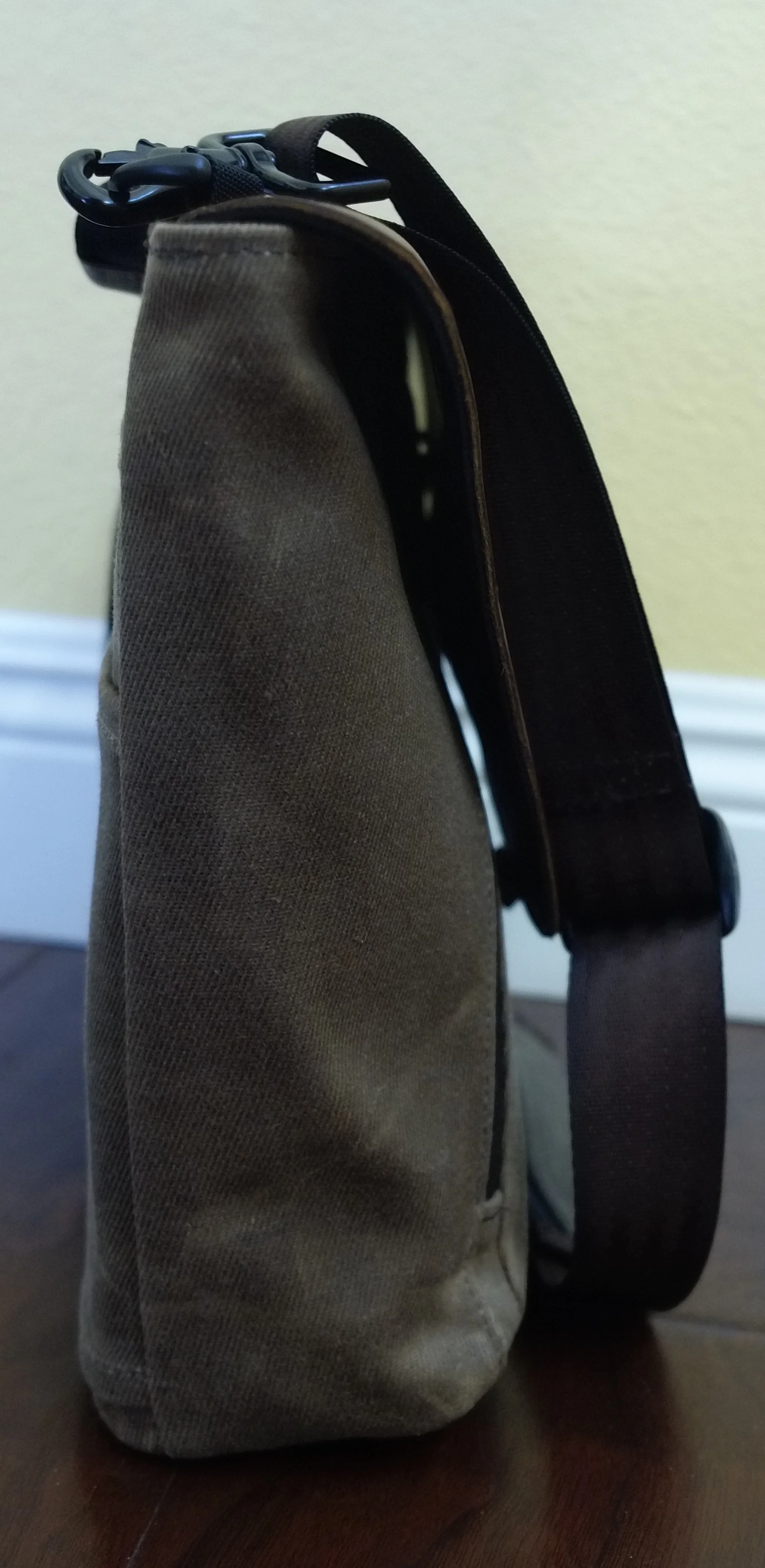
The Sutter Tech Sling is, as the name implies, a sling-style bag that can be adjusted to go over your left or right shoulder. It does this with a D-ring on the top of the bag and two separate mounting points at the bottom. On long days, it takes just seconds to move the strap and switch shoulders. Also related, the strap has a cam lock buckle that is easy to adjust while you are wearing the bag and there is a built-in shoulder pad to give you more comfort. Like other Waterfield bags, the back of the bag has a mesh padding to keep your back from getting sweaty on a hot day.

Click to enlarge.

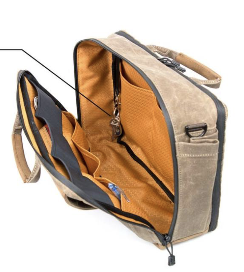
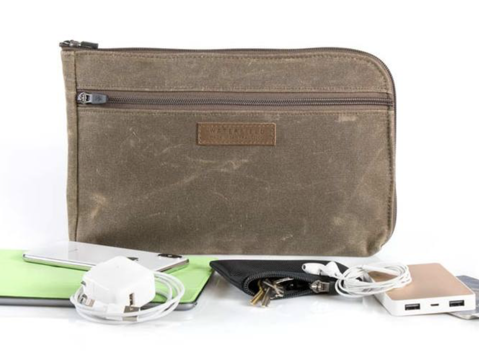
The Sutter Tech Sling comes in either brown waxed canvas and brown leather (my preference) or black ballistic nylon and black leather trim. There are two sizes: Standard (11.5" x 8" x 3" with 4.5 liters of volume) and Full (14" x 9.5" x 3" with 6.5 liters of volume). I have the Full size, which is required to carry a 12.9" iPad but even the Full-size Sutter Tech Sling is the smallest bag I've used in some time. The bag has a main compartment that contains a separate padded sections that I use for holding my iPad. There's also a front pocket compartment for holding incidentals.

Click to enlarge

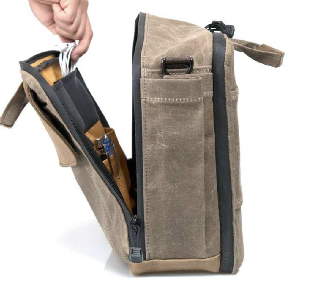
On longer outings I've got the bag stuffed with my iPad, external battery, a rolled up jacket, small umbrella, water bottle, paper notebook and pens (they sell a matching pen case), and the other bits I normally carry with no problem. The bag has side zippers on both left and right sides for the front pouch and long zippers that go to the side on its main compartment, so it is easy to slide the bag forward onto your stomach without taking it off and access your gear. I often use the Sutter Tech Sling while biking. Being able to access my sunglasses in this fashion is great.

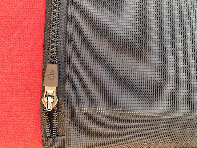
The thing I like about Waterfield bags most is the way they sweat the small stuff. The Sutter Tech Sling is no different in this regard. The clip on the key fob has a high tension spring, so I don't have to worry about losing my keys. The three pen holders are big enough to hold my larger pens (or Apple Pencil) but also tight enough to keep them from falling out in the bag. The aglets on the end of zipper pulls aren’t cheap plastic but metal barrels that look like tiny lightsaber hilts. The interior is lined with gold fabric, making it easier to find stuff in the bag. The zippers are inset and waterproof. We’ve (thankfully) had a lot of rain in southern California this winter and I've been riding my bike in the rain with this bag a lot. At no point did I see any evidence of water getting inside the bag.

My well-loved Sutter Tech Sling. Click to enlarge.

Here’s my Sutter Tech Sling after two months of abuse through rain and sun. If anything, it looks even better now than it did when it was new.

The Sutter Tech Sling has become my go-to bag. I love the compact size and the easy carry over either shoulder. Because I can switch shoulders, I am able to carry this bag with a full load through a whole day. I’ve received numerous compliments on the bag from strangers, and I’m not surprised. It's a great looking and highly functional bag. If you are looking for a sling, this is the one.

The WaterField MacBook SleeveCase Review

For a few weeks last month I was a world traveler. While it is fun getting stamps on your passport and embarrassing your children while you try to converse with people in other languages, one concern I had for the trip was getting around with my technology.

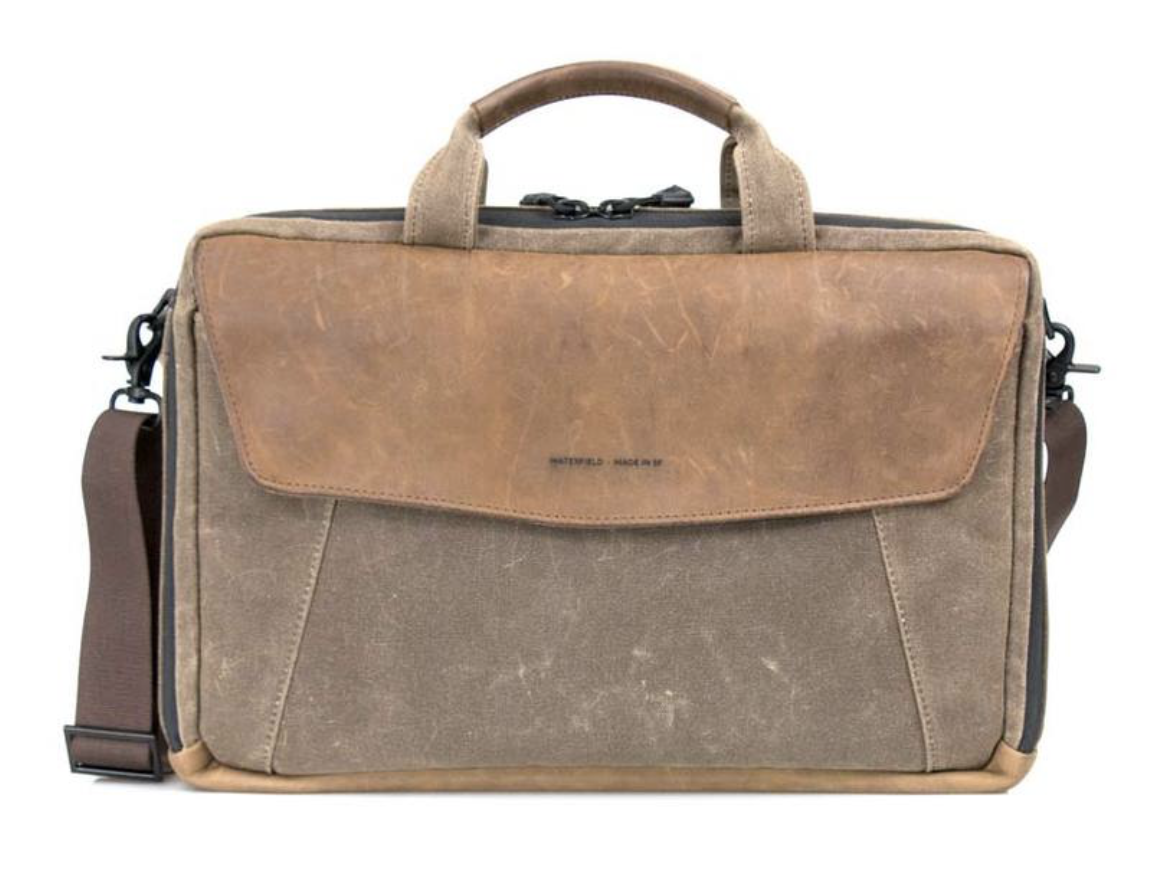
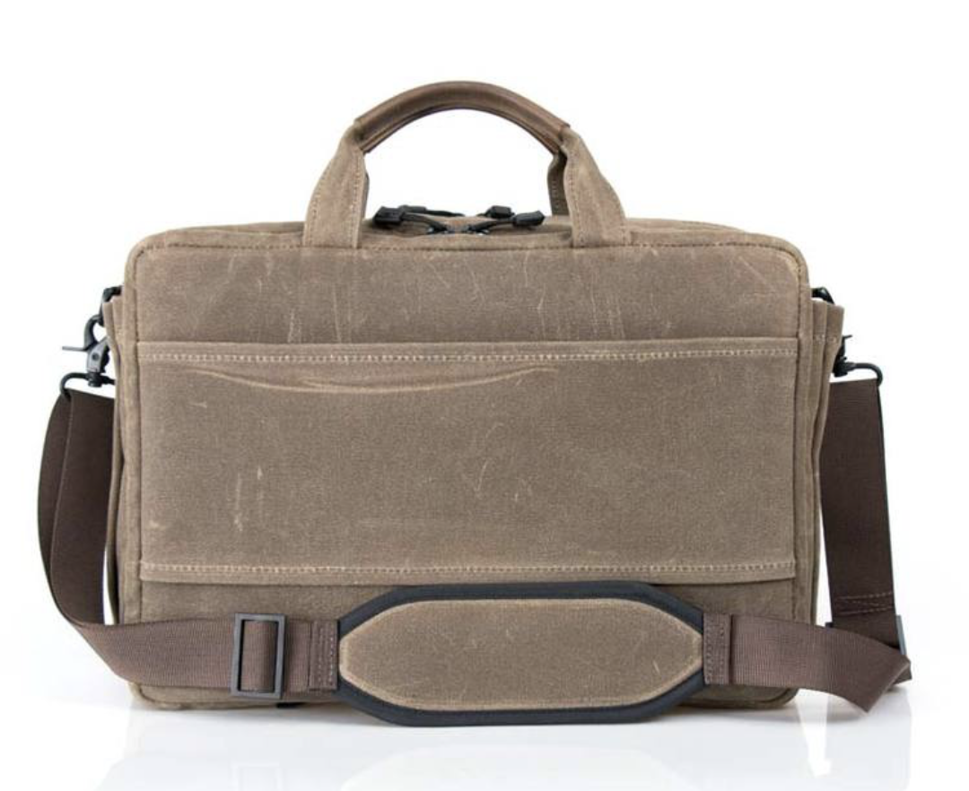
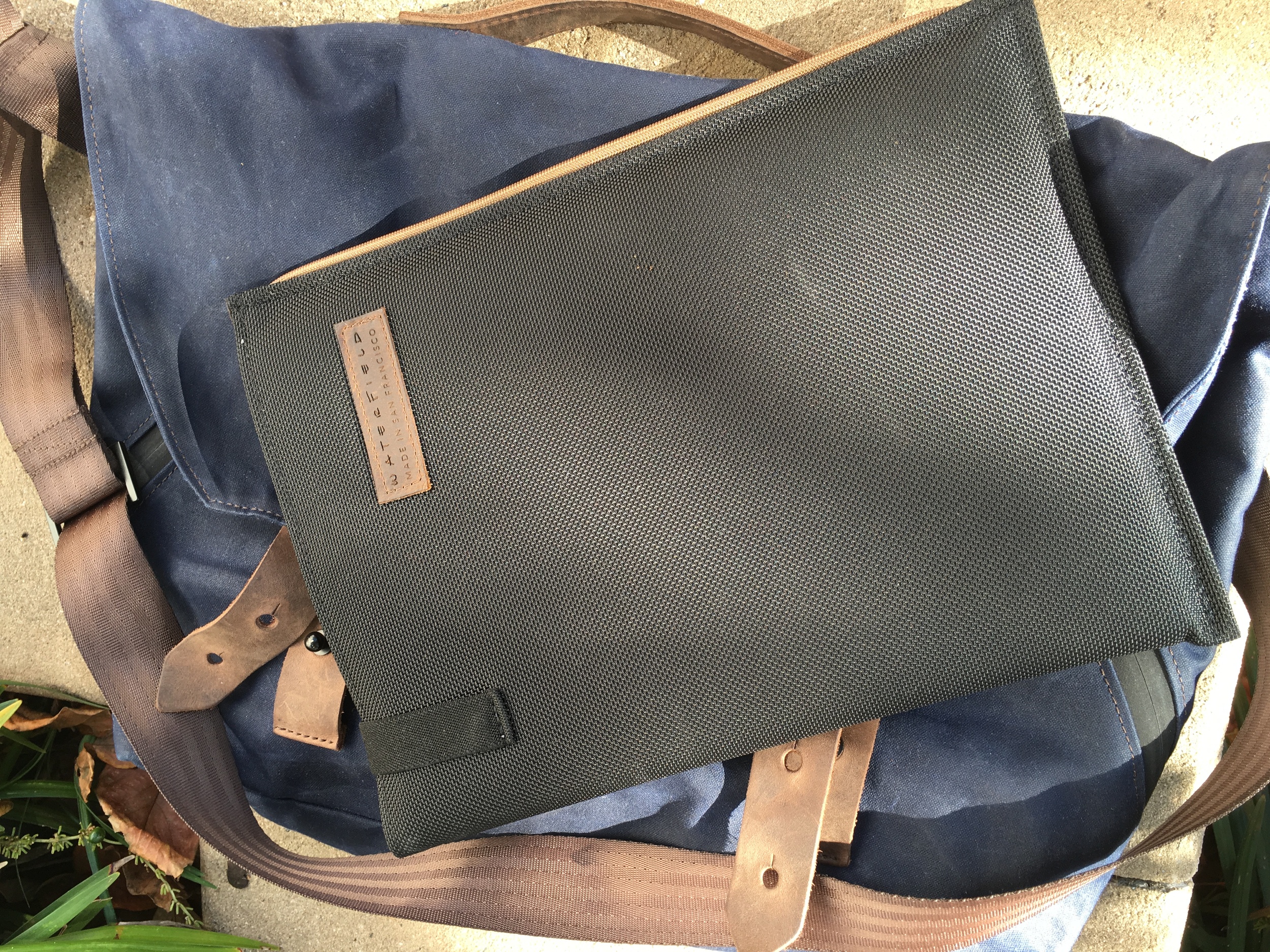
I knew I needed to bring the MacBook. My problem was I didn’t have a bag for it. Before leaving, I picked up a WaterField MacBook SleeveCase. As computer cases go, this is fairly minimal. The bag is waxed canvas (they also have a version in ballistic nylon) with a nice padded pocket to hold your MacBook and a leather flap that velcros down to keep your Mac solidly in place. I chose the waxed canvas SleeveCase with leather reinforcements. I'm pretty sure it is the same one Indiana Jones would carry if he needed such a thing.

I opted for the additional side clips and strap so I could wear it over my shoulder. I’m glad I did because I ended up carrying this computer bag everywhere.

The MacBook SleeveCases are designed to fit around the specific Apple laptop computers. They make them for all of the MacBooks ranging from the 12-inch MacBook to the 15-inch MacBook Pro. You can order the SleeveCase in either vertical or horizontal orientation. The bag is TSA approved, and I was able to put it through airport security without removing it from the SleeveCase.

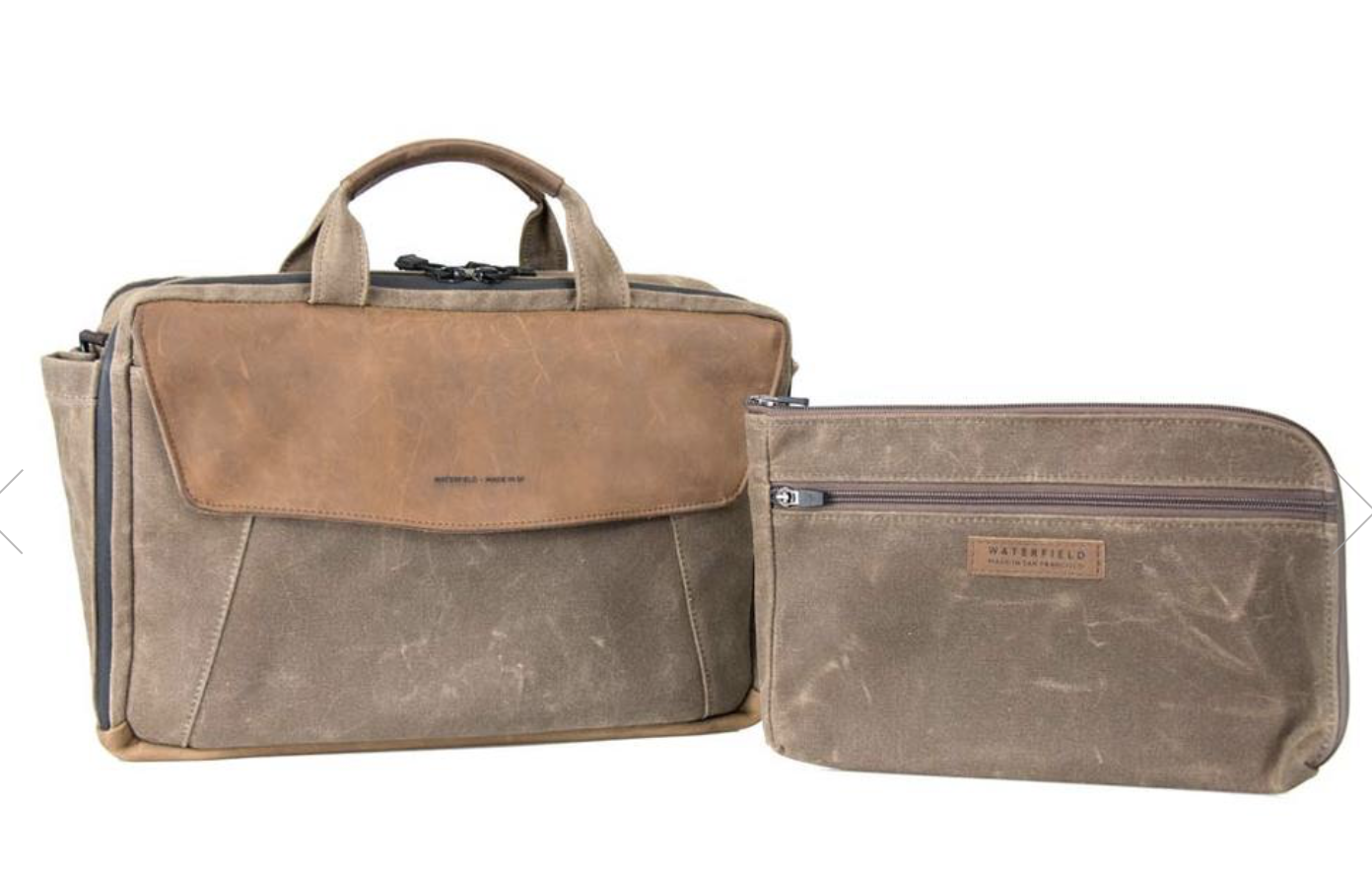
The WaterField SleeveCase does not hold much except your computer and whatever you can fit in the side pocket. There is an optional piggyback case that lets you store more accessories and attaches to the case.

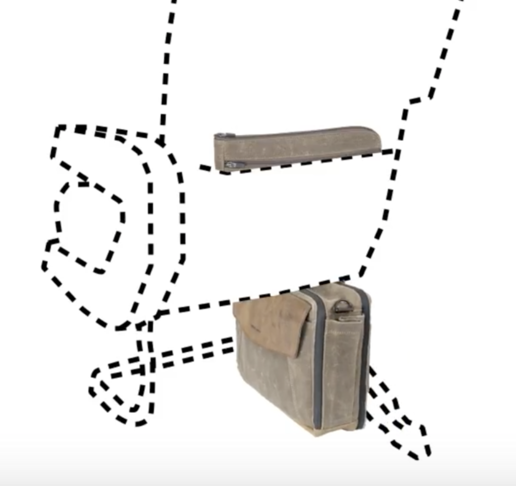
The thing I liked most about the WaterField SleeveCase is that it served two purposes. It's robust enough with the strap that you can carry it around for the day with your Mac inside. However, if I needed to carry a backpack with more gear, the case is thin enough that I could slide it into my backpack where it served as a protective sleeve for the MacBook inside the backpack. WaterField makes laptop bags with more onboard storage, like the Staad Attaché and the Outback Solo, but I needed something that could either be worn independently or easily fit in my backpack when needed. It was this dual purpose that attracted me to the SleeveCase in the first place.

Like all other WaterField products, the SleeveCase is gorgeous. At one point during the trip my teenage daughter said to me, "Dad, I like your computer bag." That's right. The bag received a compliment …  from a teenager! Somewhere at that moment an angel received its wings.

All WaterField products are made in San Francisco and built to last. I've been buying products from them for ten years, and I don't see myself stopping anytime soon. 

The Waterfield Bolt Backpack Review

My personal, well-loved Waterfield Bolt

My personal, well-loved Waterfield Bolt

I've recently become a backpack convert. While messenger bags look cool, distributing the weight of my gear to both shoulders feels a lot better at the end of the day. Waterfield is expanding its backpack line and they recently sent me their new Waterfield Bolt backpack to check out. The Bolt measures 12.5 x 16 x 5 inches. It has two zippers across the top. One gets quick access to the laptop compartment and the other gets access to the rest of the cargo. Like other Waterfield bags, the laptop compartment is its own padded sleeve that your laptop can slide into. It's big enough to hold a MacBook Pro or a large iPad Pro. There is a second sleeve sewn on top that can hold a 9.7 inch iPad. I have, on occasion carried two iPads in my Bolt because that's just how I roll.

EA3ED1F4-C8CE-4DC3-9EB2-AEFA5CA1190E.JPG

The main interior is a large cargo compartment. The Bolt has quite a bit more storage than in my Waterfield Staad laptop bag. Another feature common with Waterfield bags is the gold fabric lined interior. I didn't realize how much I appreciated this until recently I was looking for something in my daughter's non-Waterfield backpack. Most backpacks have dark fabric on the inside which makes it even harder to find things when you're digging around. The gold fabric brightens things up and makes finding my gear easier.

Also on the interior are two pockets with the Velcro fasteners to hold miscellaneous items like chargers, business cards, pens and pencils. As an iPad nerd, I can report these pockets are deep enough to hold an Apple Pencil but also shallow enough that the top of the pencil pokes up and is easily retrieved.

The bag is made out of waxed canvas with the leather on the bottom to add some additional support. There's also an integrated leather handle at the top of the bag.

EEAC7A7F-239B-4E0E-8422-212C07B07443.JPG

On the front of the bag is two additional pockets with leather tabs and magnetic closures. The pockets are pretty big and I've been keeping one loaded out with personal items, like aspirin and Kleenex, and the other is for tech supplies, like my charging battery, a few cables, and a flashlight (because everybody needs a flashlight). I like having quick access to these items without having to open up the backpack itself. Behind the two compartments is a hidden zipped pocket. There are also pouches on either side perfect for holding a water bottle.

The back of the backpack has a mesh cushion to provide ventilation on a hot day. One of the nice little touches is that this mesh cushion is only sewed on the sides of the bag. There's a gap between the cushion and the rest the bag so you can slide it over a rolling suitcase handle on trips. The straps are also padded and fit well. When wearing this backpack, I cinch the straps down so the bag rides high on my back. I find that, over the long haul, this is more comfortable.

The real story with the Waterfield products is their design and construction. These bags are made to last. I've been buying the Waterfield bags for years. I just recently gave away a Waterfield bag I bought six years ago to and it was in such good shape that my friend mistook it for new. Waterfield gets the details right with quality fabrics, heavy stitching, waterproof zippers, rain guard flaps and all the other small things that give the bag longevity.

12390CAD-41C6-4BAB-A3B3-36340518D32B.JPG

As seen in pictures, the bag is also quite attractive. They have various configurations ranging from urban to Indiana Jones. I always lean towards the bags that look like I'm about to head out on expedition.

I've been using this bag for over a month. In between a cross country trip, day hikes, and trips to Disneyland, I'm guessing I've got about 100 miles of walking with this bag on my back and I can report it still feels and looks great.

428254EA-0125-4F36-B253-3B2A2C36BA27.JPG

I now have two Waterfield backpacks. The Staad, which I reviewed a few months ago, is a bit smaller and most appropriate for day trips. If you carry a lot of gear or are looking to use a backpack for travel, you should probably step up to the Bolt. The additional cargo space, combined with the ability to attach it to a rolling suitcase and the large external pockets, make the Waterfield Bolt a perfect travel companion. I took a trip this month and the Waterfield Bolt was great.

I used to make fun of my wife for buying too many purses but given my fetish for high quality bags and backpacks, I really just need to shut up. If you're looking for a backpack for trips or carry a lot of gear, the Waterfield Bolt is for you.

24 Hours with the iPhone 6s Plus

I have now been officially using my new iPhone for 24 hours. I spent a lot of time peeking, poking and otherwise kicking the tires. Here are some initial thoughts:

6s vs. 6s Plus

There was much gnashing of teeth last year over whether to get the big one or the small one. I too was flummoxed. Never have I had so much trouble deciding between two products. Initially I bought the big one and then I traded it in for the little one. When the iBooks Store began supporting my iBooks Author books on the phone, I bought a used 6 Plus so I could test and make sure the books looked okay on it. I had intended to sell the used phone back but in the meantime my wife fell in love with my iPhone 6 and I found myself with little choice but to keep the 6 Plus. So last year I ended up spending eight months with the small phone and four months with the big phone. After all that time, I realize that there really isn’t that much difference. With the bigger phone, it’s a little more difficult to carry in your pocket and with the little phone you get slightly less battery life and the text is smaller. This time I didn’t sweat it. I just ordered the big one.

Buying Options

The new variable in the mix this year is exactly how you buy the new phone. Carriers are no longer interested in contracts and there are several options for purchase from a variety of sources. I’ve been happy with my service from AT&T throughout my iPhone ownership but at the same time I’m not all that eager to get in long-term relationships with them. So I decided to buy it from Apple. In that case I had two options: either buy it outright or buy it on on the Apple upgrade plan. Since the upgrade plan price was the same (I was going to add AppleCare plus regardless) I ended up on the Apple upgrade plan. This gives me the option to upgrade it next year if I want, although I probably won’t. (In my family I hand down the phone every year to one of my daughters.) So I bought a space gray 6s Plus with 128 GB. The storage size may raise some eyebrows but I put a lot of media, photos, and video on my phone and (in my mind at least) it’s cheaper to pay an extra hundred dollars to avoid screwing with storage allocation for the next year.

3D Touch

I’ve heard from several sources that Apple spent years perfecting this feature before adding it to the phone. That shows. It was remarkable to me how quickly peeking and poking became second nature. Using 3D Touch in mail seemed like a gimmick until I tried it. Now it is a “thing” for me. If I see a mail in my inbox and I’m not sure what it is, I peek at it. An interesting feature is the ability to apply the swipe gestures while peeking at an email. It depends on your settings but for me swiping to the left deletes the email and swiping to the right allows me to move it to a different mailbox.

3D touching app icons to get immediate access to specific features and makes performing common tasks in your favorite apps easier than ever. It’s the most significant addition to spring board since the arrival of folders. I’ve now put my camera back on my home screen because it’s so easy to hard press on it and then select whether I’m shooting a movie, selfie, or traditional photo. It’s definitely faster than opening the app and swiping around to the appropriate camera.

One more example of 3D touch that still make me giggle like a school-boy is on the iPhone keyboard. If you press it hard and start moving your finger around, it moves the cursor as if you are on a trackpad. Press just a little bit harder and begin selecting text. Do this once and you will never be able to go back to the old way of selecting text. (It’s going to kill me that I don’t have this on my iPad.)

Live Photos

Live photos are strange feature. I’ve taken a bunch of live photos at this point and while they are fun, I wonder if they are a novelty. I do, however, like the idea of looking back at some of these pictures in a few years to catch just a few seconds of my daughters being silly while I took their picture and wish I had something like this of them when they were younger. An interesting notes is that you can send live photos to other iPhones (I tested it with my daughters 5s) and they display with a long tap.

The implementation is a little spotty. When viewing a live photo with a hard press, the screen goes blurry and then start showing the video. The delay and blur feel pretty odd. Likewise, the quality of the images in the video are not particularly good. I found it hard to keep things in focus even while resting the phone on a stable surface while taking the live photo.

My wife, who is not a nerd, loves live photos and has been using it nonstop since she got her phone. I think it is her big thing with the new phone. That makes me wonder that maybe I’m reading this wrong and non-nerds will really embrace live photos. If they do, I hope they are doing so on something bigger than the 16 GB entry-level iPhones.

Touch ID

I’m more impressed than I expected to be with the new Touch ID speed. It is so fast that I barely see the lock screen. When I wanted to test a live photo as my lock screen wallpaper, I couldn’t get to the lock screen because Touch ID was unlocking the phone so quickly. Instead I had to use the sleep-wake button on the side.

The New Camera

Every year the iPhone camera gets iteratively better. With the big move from 8 to 12 megapixels this year, I feel a lot more comfortable taking wide shots with the knowledge that I can zoom in on them later without losing too much image integrity. The camera quality of the iPhone 6 was pretty good to begin with. Taking pictures outdoors with good light, I couldn’t see much difference between the iPhone 6 and the iPhone 6s. In low light however, the difference was noticeable. While the iPhone still is not going to replace your SLR or mirrorless camera, as a carry around camera, it’s pretty amazing. The below gallery shows some images I took last night at Disneyland with the new camera and some comparison shots with the iPhone 6 Plus camera. All images are not edited.

Comparison of the new front facing "selfie" camera isn't fair. The new camera is far superior with the 5 megapixel sensor. The screen-as-flash feature really works and doesn't make you look blown  out.

I did some tests for the amount of time it takes to take a photograph. I saw no noticeable difference between the 6 and 6s. However, the 3D Touch interface does let me get to the appropriate camera much faster than the old iPhone did.

Speed

Between the RAM (iPhone now has 2 gigabytes of RAM) and the A9 processor upgrades, the iPhone 6s is a screamer. I’ve only began to scratch the surface on this but I can already see that jumping through multiple tabs in Safari, downloading and updating a large OmniFocus database, and making alterations to photos are all noticeably snappier on the new phone. 

The most interesting story about the performance improvements for me is not what I can do today but what will happen tomorrow. With mobile devices approaching “desktop class” processing speeds, how much more awesome can app developers make the mobile devices. The powerful apps demonstrated by Adobe and Microsoft at the Apple event are just the tip of the iceberg. I expect in a couple years we are going to have a lot more “power” mobile apps available to us. 

There still are a lot of questions about how developers can create that market in the current “race to the bottom” pricing wars but there is no question the hardware and evolving touch interface can support a more advanced class of software. I can’t wait to see how this turns out.

Upgrade?

One of my daughters is currently rocking her iPhone 5S and doing just fine with it. Nevertheless, every year the iPhone evolves and gets a little better. This year’s iteration feels like it has evolved a bit more than iPhones in the past. If your current iPhone does not support 3D Touch, you’re missing out. That doesn’t mean you have to upgrade though. Using a three-year-old iPhone is perfectly adequate and fully supported by the current iOS 9 software. All that said, with their own upgrade plan, Apple has made it easier than ever to get into the new iPhone and I expect a lot of people will be doing just that.

Saying “No” to the Master

Over the years I’ve got very adept at using the trackpad. The clincher for me was when Apple started introducing multitouch gestures. Whether I’m at my MacBook or iMac, as I go through the day I do flicks, swipes, and other gestures that make my computer dance for me. Once I mastered the built-in multitouch features, I downloaded Better Touch Tool and took the trackpad interface even further. At this point I’ve mastered the trackpad and using it feels a little bit more like playing the piano than a computer interface.

Nevertheless, I’m always interested in how things are going on the other side. Recently, I heard Myke Hurley talking about his brand-new Logitech MX Master mouse (Logitech) (Amazon). Myke loves it. With this mouse, Logitech has combined a weighty, ergonomic mouse with multiple buttons and inputs. Myke, for example, was able to drastically reduce the amount of time it takes him to edit a podcast using the programmable features of the MX Master.

This got me interested so I picked one up at the local Best Buy, keeping mindful of their two-week return policy. Myke was right. This is a remarkable mouse. It’s been years since I used a mouse and the ergonomics of the MX Master are better than any mouse I ever recall using. (They are definitely better than the Apple Magic mouse.) Likewise, just about every surface on this mouse has something you can press to make stuff happen on your Mac. In addition to the two buttons, there is a rolling wheel that can be switched between a ratcheting click or a flywheel inspired free roll. There’s also a separate scroller under your thumb and several additional buttons. The Logitech software loaded on my El Capitan Mac without breaking anything and the mouse performed without flaw for two weeks. I was able to program in many of the functions I pull off now with my trackpad using mouse buttons. The only real criticism I have is that it uses a USB dongle instead of natively pairing with the Mac through Bluetooth.

Nevertheless, I took it back. The problem was that I never truly warmed up to the mouse. If I had used it another month or two, the button layout probably would’ve become second nature just as the trackpad has for me. However, in my case, I’ve moved on. I am able to make a trackpad do a lot for me and it doesn’t move around the table, bumping into my glass of water or papers on my desk. Because I have my trackpad set up to click on tap (yes, I am one of those people), it requires virtually no force to click on my trackpad. Indeed as I go throughout the day, if one finger starts feeling a little stiff, I use a different finger for taps. While I was able to replicate many of the gestures I do with a trackpad on this super mouse, I was not able to replicate them all. Better Touch Tool gives you a seemingly infinite number of potential inputs on the trackpad. For instance, one of mine is to rest my third, fourth, and fifth fingers on the trackpad and tap with my index finger. Complex gesture like this simply are not possible with a mouse.

Finally, the biggest advantage of a mouse over a trackpad, more precise movement, didn’t really pay off for me. The mouse may have been slightly faster for some tasks, but I didn’t feel it or appreciate it enough to want to trade in my trackpad for mouse.

Now I know that some anarchists like to use both the trackpad and the mouse at the same time. If I were to go that route, I would just use an existing Magic mouse from a drawer rather than spend $100 on the souped up MX Master.

In summary, if you are mouse person, I’m not sure you could do any better than the MX Master. If you’re a trackpad person, you’re probably fine sticking to your guns.

Review: Inateck Aluminum Unibody USB-C 3 Port USB and Ethernet Hub

With the inclusion of the USB-C port, the new MacBook is more friendly to third party parts manufacturers than it has been in a long time. There’s already a long list of established accessory makers and upstart Kickstarters all cooking up ideas to take advantage of this new port. 

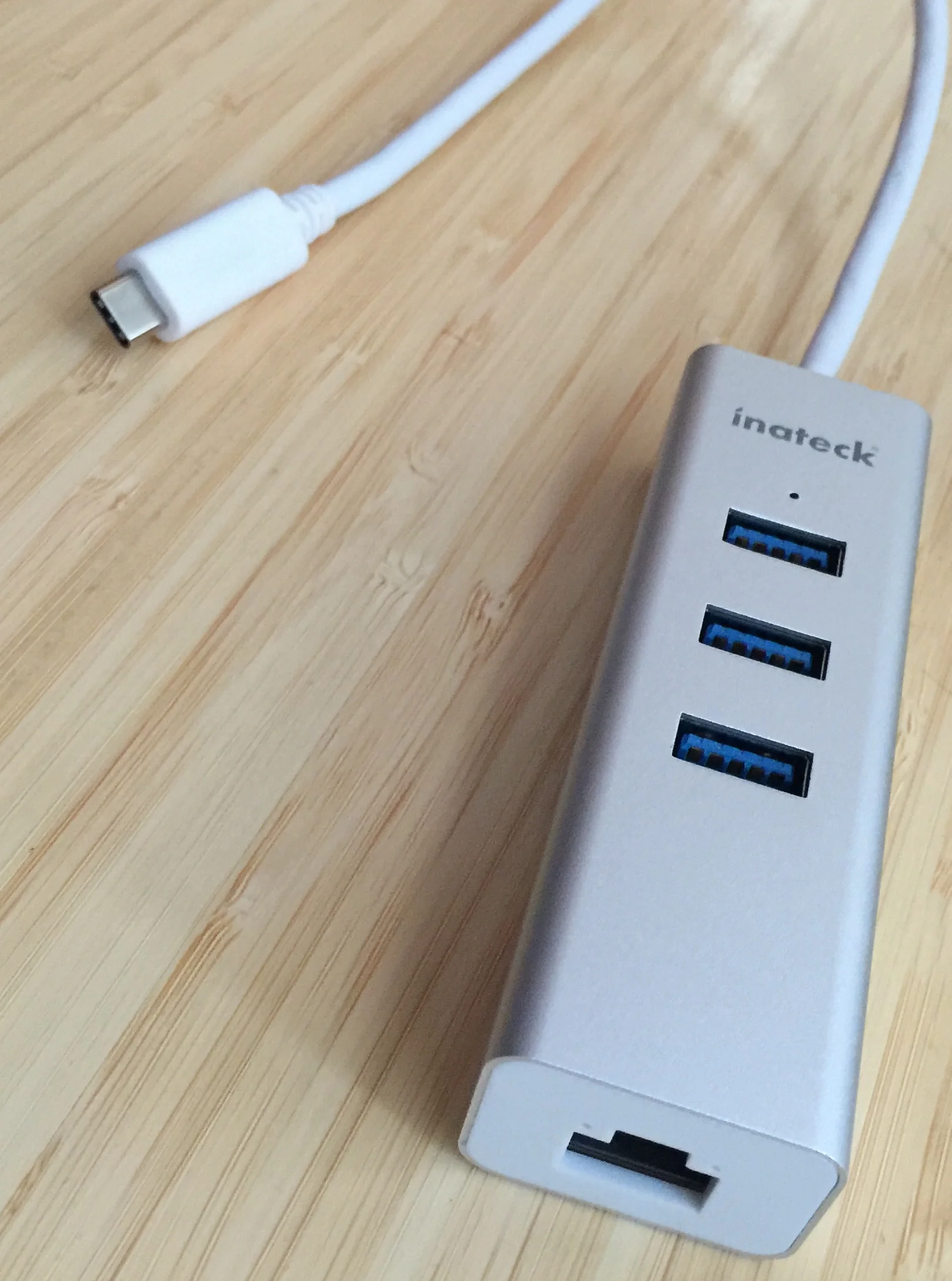
One of the first arrivals in my bag is the Inateck Unibody USB Hub (Product Page) (Amazon). This travel-friendly device features three bus powered USB 3.0 ports and an Gigabit Ethernet port. This is all in a small package less than 4 inches long and 1 inch wide. It has a 1 foot USB-C cable attached for plugging into your MacBook. I’ve been testing the Inatech against the Apple USB to USB-C adapter and find no discernable difference in data transfer speeds. While about $10 more than the Apple adapter, I think the Inatech’s two additional USB ports and Gigabit Ethernet make it the better value.

I like this device because it has a nice aluminum design that is befitting the new MacBook and gives me a lot of flexibility for just a little room in my bag.

Watermarker

Screen Shot 2012-12-04 at 7.39.54 AM.png

Don Southard is a really clever guy. He comes up with some amazing little solutions for getting more done on your Mac and he's also a really fine writer with his pieces over at MacStories. Don just recently released a new application for the Mac, Watermarker. I like it. It's a simple application that consistently applies watermarks to images. My wife is using it every day right now as she writes her ongoing series about Christmas ornaments. If you want an easy way to watermark photographs and want to support a standup guy, check out Watermarker.

OmniOutliner for iPad Review

The day the Omni Group releases a new iPad app always feels a little bit like productivity-nerd Christmas. There is always a lot of anticipation leading up to the event and, despite having spent far too much time thinking about how the Omni UI wizards will go about it, you always find a few unexpected surprises. With today’s release of OmniOutliner for iPad ($20), the Christmas metaphor holds up.

Last year, no sooner did we get OmniFocus installed than we all immediately started clamoring for OmniOutliner. So now it is here. How does OmniOutliner stack up against are expectations? I’ve been using the app through the beta and report the Omni Group delivered, again.

Interface and Iteration

What puts the Omni Group applications above others is their unwillingness to accept “good enough.” The Omni Group spends a lot of time getting the touch interface right. With each new iPad app, they realize they are blazing a trail. They generally throw out all the assumptions made with building an interface for a traditional keyboard and mouse and start over. OmniOutliner is not a simple port of the Mac OS X app. Instead, it is a ground up, outlining application built around the iPad’s strengths (and weaknesses).

Outlining

Outlining real simple. Type an entry and then use the arrow icon buttons at the bottom of the screen to promote or demote entries. For speed outlining, that is it. No magic incantations or multiple button taps. Type the words. Set the level. Move on.

To type on a line, double tap it. A curser drops in and the iPad on-screen keyboard jumps to life. Once done editing, tap the row handle to the left and OmniOutliner exits edit mode. The row handles also include icons to display row level. Any rows without children appear as a dot. Rows with children have an oversized disclosure triangle. Tapping the triangle will collapse and expand the children points below it. OmniOutliner also includes the ability to add notes in an option text field below individual entries. This is one of the Mac OS X features that came over to iPad and it is damn useful.

Tapping the Edit button brings up a series of editing tools to move, group, and delete individual entries. Even easier though is grabbing and moving the row handles and moving manually.

Columns and Customization

It wouldn’t be OmniOutliner without columns and the iPad iteration delivers. You can add columns of various formats including text, numbers, date, duration, pop-up list, and checkboxes. Everything is intuitive and creating and styling new columns is easy. With certain formats, like numbers, OmniOutliner will optionally perform a math functions providing totals, averages, minimum and maximum values, and additional functions.

There is a lot of customization available under the hood. Tapping the Tools icon button opens a popover that lets you set styles and view for the entire document or the current selection. You can also create custom styles for certain outline levels. The screenshot, for instance set a tan background, bold typeface, and numbering for the level one entries.

One of the many nice touches are the built in color schemes. The color picker includes a series of custom palettes. These are the same color options available in the iPad OmniGraffle app and much better than those available in the Mac OS X color picker.

Document Management

Document management is handled in the document view. This app feels a lot like Apple’s iWork apps in this regard. You flick between documents and tap one to open it. There are also options to open documents from iDisk or a WebDAV server. There is no Dropbox access. The Omni Group explained that they are still exploring ways to make online sync better. However, if you really need that Dropbox sync, you can use a DropDAV account and access your Dropbox files via WebDAV. You can also export outlines to iDisk, WebDAV, and iTunes or send them as a mail attachment. Export options include the OmniOutliner format, HTML (both simple and dynamic), plain text, and my beloved OPML.

Summary

When the iPad was first announced, OmniOutliner was one of those apps that I thought would be perfect for it. I often use outlines for brainstorming and organizing thoughts. I also use OmniOutliner to take depositions and prepare witness examinations. Furthermore, every one of the last fifty episodes of the Mac Power Users started life as an OmniOutline. I miss the templates available in OmniOutliner Pro on my Mac and native Dropbox support would have been nice but I’ve been using the iPad OmniOutliner exclusively for a month and the iPad has supplanted my Mac as my “go to” outlining device. Like mind mapping, outlining really lends itself to the touch interface. The Omni Group just “gets” the iPad and it is no surprise that they nailed it again with OmniOutliner for iPad.

Tom Bihn Ristretto for 13" MacBook Air Review

Over the past year, I’ve changed up my mobile gear. I got my beloved iPad and sold my once mighty MacBook Pro in exchange for an underpowered 13” MacBook Air, which I adore.

Leading up to Macworld, I decided I was going to spoil myself with a fancy-pants case for the MacBook Air. I ended up with a nice leather bag that gave me that perfect hipster look necessary for a trip to San Francisco. The trouble is, my bag had a lousy strap and it was uncomfortable carrying it around all day. I toyed with the idea of doing some surgery on the strap to install my Tom Bihn Absolute Strap but there was really no way to do it right. So I sat there looking at my Tom Bihn Ristretto iPad case and thought it sure would be nice if it held my MacBook. After that obvious revelation, a quick trip to Tom Bihn’s site revealed that, indeed, Tom Bihn does make such a bag, the Ristretto for the 13” MacBook/MacBook Air.

The Ristretto is a vertical messenger bag, letting you slide your MacBook Air down inside sideways. Both sides of the laptop compartment are padded but only one has the nice soft nylon material (the other side is a relatively soft canvas) so you need to give some thought as to how you align the MacBook when you slide it in. The compartment easily holds both the 13” MacBook, 13” MacBook Pro, and their thinner sibling, the 13” MacBook Air. Ideally there would be some more foam padding in the bottom of the laptop compartment since one very likely damage vector comes from dropping the bag and it landing on its bottom. I cut a length of stiff packing foam and dropped it in mine. With that slight modification, I’m satisfied with the protection this bag affords my MacBook Air.

There is a second large compartment next to the laptop sleeve that works great for holding my iPad. There is also a zippered compartment (nice for holding my wallet and other important bits and pieces) and several other small sewn compartments that hold pens, Field Notes, a USB hard drive, and a few cables. Interestingly, I don’t normally carry my AC Power adapter. Instead I leave it in the car since I so rarely need it when out and about.

There are also three o-rings, letting you attach keys, pouches, and other items. Tom Bihn sells several accessories for the bag so you can trick it out as you please. One of the o-rings includes and 8” key strap. The back of the Ristretto has a slanted, open-top pocket great for holding the mail or other random papers.

The bag ships with removable waist straps helpful to secure the bag to your body if you are active. The straps unclip easily so you don’t have them hanging on when not needed. There are multiple color schemes available. I went with black and steel.

The Ristretto ships with a nice wide shoulder strap but for more comfort, pay the extra $20 for the Absolute Shoulder Strap. This strap includes a soft neoprene pad. It is both light and comfortable. It is the nicest strap I’ve ever used on a bag. It is so nice that I attach it to any bag I use. Also, it appears they’ve nailed the problem with the strap squeaking that I had when I looked at the iPad Ristretto bag.

At $140 (including the Absolute Strap), the Tom Bihn Ristretto for 13” MacBook is no small investment but I believe it is worth it. This is a well crafted bag, made in the USA, that I plan to use for years to come.

Kensington Presenter Pro Review

My beloved remote has failed me. I’ve been using it for at least 6 years without a hitch and suddenly (despite new batteries, cleaning the contacts, and a few kindly whacks) it has stopped advancing slides. So time for a new one and I took advantage of Macworld Expo to do some shopping.

For me the perfect remote has four buttons: advance, backward, dark screen, and laser. I don’t want extra bells and whistles that I will start pressing in nervous fits. So that was my shopping list, a Mac friendly remote with just the right number of buttons. I found my new remote on the expo floor, the Kensington Presenter Pro with Green Laser and Memory.

The Kensington Presenter Pro ($99) (find the manual here) fits nicely in my hand and features four buttons: slide advance, slide back, laser, and dark screen. It includes a dongle that stores inside the remote. The device works on a 2.4 GHz wireless signal that worked for me up to about 100 feet. Everything just works on the Mac. What really makes this remote shine however are the little details

The Laser

The Kensington Presenter Pro uses a green laser. While green lasers aren’t as unique as they used to be, they are still a lot more rare than red lasers, which is great. When I’m speaking, my green laser looks different, and that’s good. People know when I point. There is also some science involved. Green light is right in the middle of the visible spectrum where red light is on the edge (meaning less visible). So it has a bright shiny laser with a different color. That’s a plus.

The Thumb Drive

The USB key does more than talk to the remote. It also has 2 GB of onboard storage and a micro SD slot supporting cards up to 32 GB. That means you can put a copy of your Keynote right on the thumb stick as a last ditch back up in case everything else goes wrong. It also means you could conceivably walk in a room with a remote only, plug it in to a Mac and start talking.

The Power Switch

Another nice touch is the inclusion of a sliding power switch. My old remote didn’t have one and it made me crazy. You never knew when the laser might get accidentally pressed in my bag and I’d get to my location to find the batteries dead. As a result, I still have this manic desire to carry extra AAAs whenever I speak.

The Case

The Presenter Pro also includes a zippered case form fitted to hold your remote. It fits nicely in my bag without a big footprint.

Overall, the new remote is a winner.

Audioengine P4 Passive Speakers

Audioengine, the company that melds a former Apple designer with a speaker guru has, for several years, released some very powerful bookshelf sized powered speakers for all of your iDevices. Recently, however, the company started selling a new line of passive speakers, the Audioengine P4.

Until now, if you wanted to hook up Audioengine speakers to your existing receiver, you were out of luck. All of Audioengine’s speapers before the P4 included their own powered amplifier, which was great for plugging into iDevices but no fun if you wanted to plug them into your existing amplifiers or surround-sound receivers. The P4 solves this problem removing the amplifier.

The speakers have the standard 2 wire connections and include threaded inserts for attaching to stands, walls, and ceiling bracket systems. Despite, their small size, they are beefy and well-built. The speakers are 9 inches tall by 5.5 inches wide by 6.5 inches deep and ship in cloth sacks that would get the approval of Steve Jobs.

But how do they sound?

The AP4s sound great. I’ve always been happy with the sound output from the relatively small bookshelf sized Audioengine speakers. You can crank them up and get a minimum of distortion. The company cut its teeth in the speaker business engineering high performance studio monitors, those speakers musicians use when recording. I’ve spent my fair share of time with studio monitors in my musician days. The best ones have to be rugged and able to play loud enough to give you the mix back despite all the other noise. This pedigree comes out in the Audioengine speakers.

The speakers include several features common with Audioengine’s other speakers including hand-built cabinets, 5-way gold-plated binding posts, silk dome tweeters and kevlar woofers, and they are magnetically shielded.

All of the Audioengine products share the same tuning so they work great together. I’m using my existing P4s to replace my two primary speakers on my stereo but considering buying two additional P4s to replace my surround speakers so everything is tuned together.

Whenever I can find the time, I enjoy butchering Thelonious Monk and Oscar Peterson songs on my Midi keyboard. While this is just a dull memory of my past degree of music nerdiness, sound is important to me and the Audioengine products suit very nicely indeed.

Pricing starts at $249. Audioengine contiues to offer its 30 day audition. If you purchase the speakers from Audioengine’s online store and are not satisfied, you can return them in the original packaging in like-new, undamaged condition within 30 days of purchase and get a full refund of your purchase price.

iStopMotion 2 - Improves on an Original

iStopMotion, that easy-to-use stop motion application that everyone loves, got an update. The Boinx team worked overtime on this one. IStopMotion has everything you need to make your own stop motion movies. You boot up the application and use your built in iSight or tethered camera to shoot your masterpiece, one frame at a time.

You can make your own clay-mation movie or retell “To Kill a Mockingbird” using Legos. Your imagination is your only limitation. There is a tilt shift generator that lets you take a scene and make it look miniature. Here is an example from Boinx. This application is much more powerful than initially meets the eye. Want to do green screen? There is a chroma key.

The finalized product can be easily exported to iMovie to add transitions, effects, and publication.

iStopMotion has other applications as well. You can make stop motion photography. My family is making a time lapsed video of us decorating our Christmas tree this weekend. You can also use it to make flip books, which can be lots of fun at a party. (Just load up on printer ink first.) There are three flavors, Home $49, with the basic features, Express ($99) for more serious movie makers and Pro ($499) that includes high end features like Final Cut integration, HD, and maximum output at 10,000 x 10,000.

I could prattle on about how much fun it is putting this application in the hands of my children and watching what they do with it but that is just the half of it. In truth, I love letting out my own inner Spielberg and iStopMotion makes this dead simple.