Ulysses Mobile Grammar Tools

I’m currently working on a future secret Field Guide project that involves a lot of writing. So, before digging in I took another look at all the writing tools, as you do, and settled on Ulysses(https://ulysses.app). That was in January. The Ulysses updates this year have only affirmed that decision.

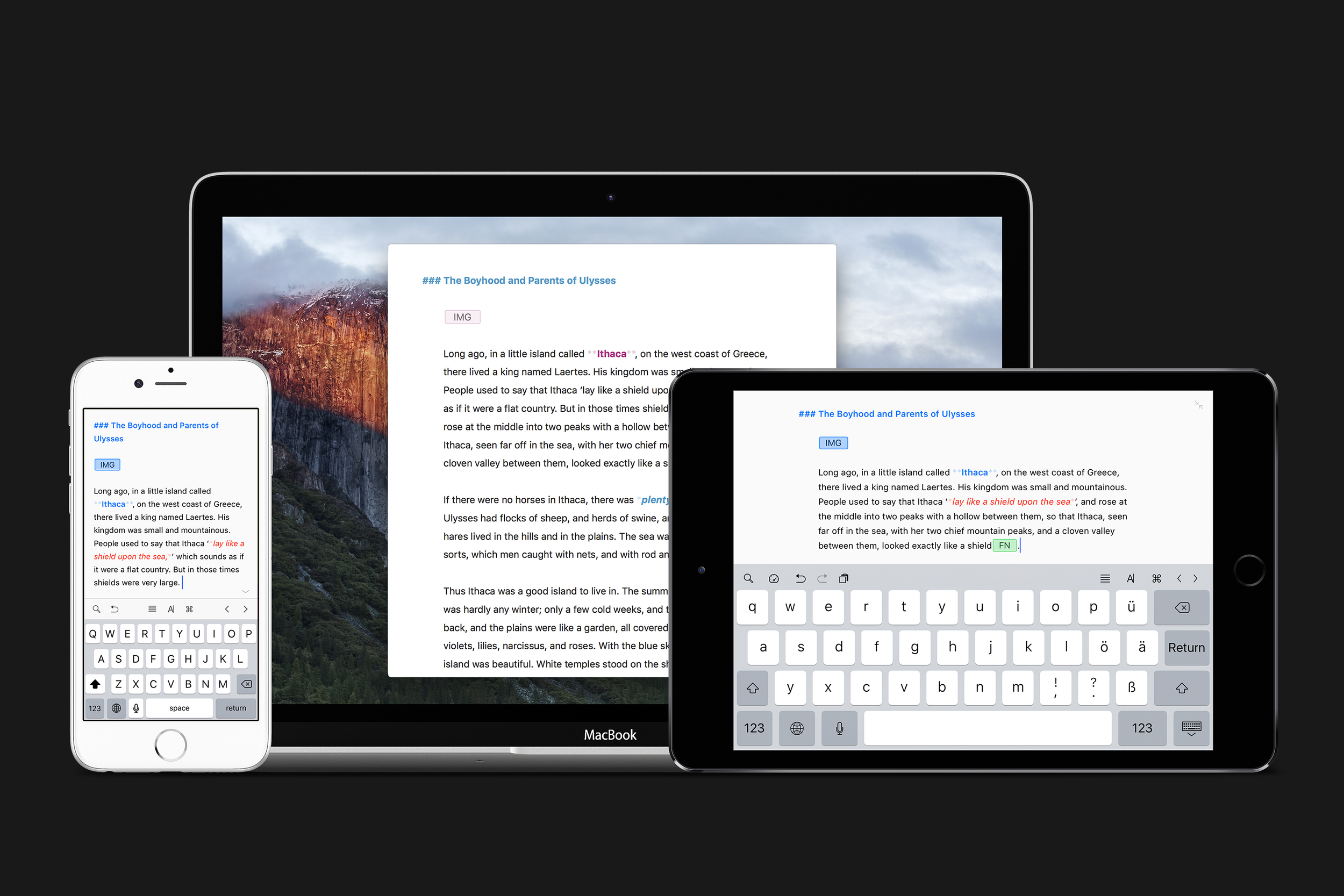
Most recently, we got version 21 on the iPad and iPhone(https://ulysses.app/releases/). The headline feature is grammar, style check, and text revisions. With revisions mode, you can track your annotations and comments in addition to the app’s grammar and style suggestions. I immediately implemented these features in my secret project, and my words are better for it.

Get Three Free Months of Ulysses – Sponsor

This week, MacSparky is sponsored by Ulysses, the writing application I use every day. Ulysses gives me a focused writing environment, eliminating distractions and encouraging me to do the hard work of moving the cursor across the line.

While there are plenty of minimalist writing tools, there is only one Ulysses. That is because in addition to obsessive design, Ulysses has some real power under the hood.

I love the way Ulysses organizes the various facets of my life and where I do my writing. This screenshot is only the tip of the iceberg for me. As I go deeper in these levels, I have all sorts of text that I'm currently writing, have already written, or use as a reference. And because it syncs across macOS and iOS, all of it is always available to me. There is a reason I always have this app open.

For the latest operating system updates, Ulysses was there. Version 14 adds a new dark mode, better designs on sheets, Siri Shortcuts integration, and iPhone XS Max support. The Siri Shortcut support lets you create a new sheet, view an individual sheet, or even view a group of sheets. 

My thanks to Ulysses for not only sponsoring the website this week, but also for helping me move the cursor every day. You can get three free months of Ulysses with this link. Check it out.

Ulysses Updates to Support Drag and Drop on iOS

Today Ulysses released its iOS 11-friendly update. With this update, the interface follows a lot of the iOS 11 user interface conventions, like big text at the tops of lists. My favorite part of the update, however, is Drag and Drop support. You can now pick up and move individual text buckets and move them around inside Ulysses. This is, for me, the most useful new feature. I am continually moving notes around inside Ulysses, and now it is much easier (and faster). I also feel that, inherently, the Drag and Drop paradigm makes a lot more sense when working on the iPad or iPhone. The Drag and Drop also extend to other applications, letting you drag text passages and images between Ulysses and other application. One more new feature that made it to both the Mac and iOS application is image preview. Now you can see previews of your imported images.

Learn Ulysses

I know that Ulysses is the subject of some controversy lately as a result of their switch to a subscription model, but I have been using the app quite a bit in my large writing project workflows. One of the things I like about Ulysses is its relative ease of use. However, like all great apps, there are some hidden depths there. If you are using Ulysses and would like to get better at it, I recommend the Sweet Setup's new Learn Ulysses course. Shawn Blanc and team did a great job on these instructional videos.

structured-with-ulysses.jpg

Ulysses Moves to the Subscription Model

This week Ulysses moved to a subscription model. As Dr. Drang has already observed, this will lead to much gnashing of teeth and navel gazing concerning subscription pricing.

At this point I feel as if I'm over it. I use Ulysses every day. I’ve already signed up for the discounted pre-owner subscription and I'm back to work. If you don’t want Ulysses in your life, you should take a pass.

What you shouldn’t do is trash the app in review because you’re not happy with the business model. Here’s Ulysses’s rating as of a few minutes ago. This App deserves so much more than 2.5 stars.

While I'm on the subject of Ulysses, I should mention why I subscribed. I use the heck out of this app. It syncs great between iOS and Mac. I like the opinionated design. Of increasing importance to me, it works great with automation on iOS. For example, one of my tricks is that when I set up a new podcast project, Workflow (among other things) creates the skeleton text and links for me in Ulysses so when the show publishes, the post is already half written … by robots!

I’ve also moved all of my text-bank style text into Ulysses and out of Apple Notes. I like the organization in Ulysses better and in Ulysses I can even assemble different text snippets into a starting place for documents without too much effort.

In addition to Ulysses, Disney also announced this week that they are pulling their content out of Netflix to start their own service that will … of course … be a separate subscription. This subscription model is only getting bigger in the years to come.

Ulysses Version 2.8

As time goes on, Ulysses (website) (Mac App Store) (iOS App Store) becomes more and more important in my writing workflows. At this point I'm using it for much of my books, this blog, and extended legal writing. I like the app’s clean design. (It won an Apple Design Award last year.) I also like its reliability and ubiquity on all of my Apple devices. Yesterday they released the newest version 2.8. There are several new features worth mention.

Touch ID Security

The updated version adds Touch ID security. You can now add a password to your Ulysses file and optionally open it with Touch ID. As a lawyer, I appreciate this. It's now going to be a lot harder for unwanted eyes to see my briefs.

New Automation Tools

The new version also adds some additional automation tools via URL callbacks. Specifically, you can now set a group title and you can read from an existing sheet. That second one is interesting. As I'm increasingly using Workflow to automate Ulysses, the ability to pull data out of the database will be useful. I need to play with this more before I can share some useful Workflows but they will be coming.

Better filters Statistics

Document management tools got a bump as well. Filters can now also be used to narrow down the library content according to negative criteria. For instance, you can look for documents that do not include the word “rutabaga”. You can also now see text statistics for groups and filters, which up until today was only available on the Mac version.

An Interesting Story about Icons

I met some of the Ulysses team last year at WWDC. We got in an extended discussion about, of all things, icons. I find the little icons in Ulysses useful as a visual guide as I'm working through my various banks of words. Here's a screenshot of my MacSparky folder and its related icons. 

I asked why can't add my own custom icons and they gave me a very opinionated answer. Put simply, they don't want anyone but their own design team putting graphics into Ulysses. As a compromise, however, they said they take user requests for additional icons very seriously. They explained they intended to regularly update the app with custom designed icons in response to user requests. 

While this approach can work, they’ve got to make good on it. Today they did with several new and interesting icons to help customize your Ulysses groups. I will note that while they have rain clouds, they don’t have a MacSparky thunderbolt. Hopefully 2.9.

Ulysses 2.7

Today Ulysses got a significant update to version 2.7. The new version adds several useful features.

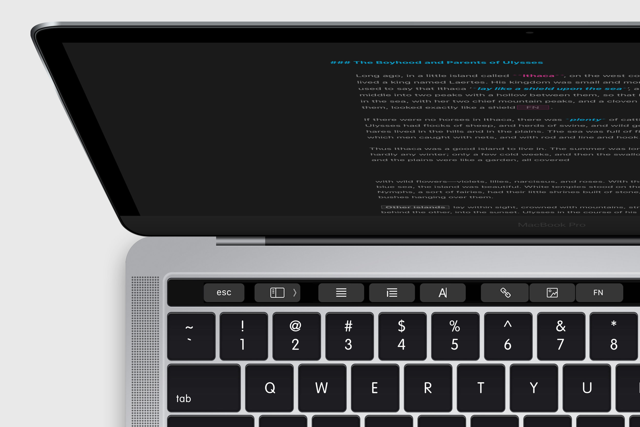
Touch Bar Support

This new version fully supports the Touch Bar. It is interesting to note how some developers are using the Touch Bar to replace keyboard shortcut functions and others are using it to add new and different functionality. It is still early days and, since I am already pretty handy with keyboard shortcuts, I prefer the new functionality model. Ulysses’ update includes a little bit of both. It’s obvious that conscientious app developers are struggling with how best to take advantage of the Touch Bar and I expect the design language around the Touch Bar is going to evolve quite a bit in the next year.

Sierra Tabs

The Sierra update made it easy to add tabs to any application. This makes a ton of sense in an application like Ulysses and now it supports it.

There is More

Additionally, the new version supports storing images in external folders and Evernote import. Is it just me or does it seem like a lot of developers are finding ways to accommodate unhappy Evernote users?

This is a nice update for Ulysses and I’m happy to see the continued development and support. You can read more about the Ulysses update on their blog.

Ulysses for iPhone

Ulysses is an interesting long form tool for Mac and the iPad. For me, it falls somewhere between a traditional text editor and Scrivener. I'm currently using it to write one of the two field guides I’ve got in development (Yes. Two.) and I've been pretty happy with the experience.

Today Ulysses’ developers, The Soulmen, announced they’re working on an iPhone version along with some iPad Pro tweaks to their already excellent iPad version. They’ve already announced that when complete, it will be a universal version and they’re looking for beta testers so now’s your chance.

Ulysses, a Noteworthy Addition to the iPad

A few years ago I first noticed Ulysses emerging from the dearth of text editors on the Mac. Except for Scrivener, there just aren't many writing applications that give a writer the types of tools that can help them elevate their game.

Ulysses for Mac stands out and the Ulysses team, for lack of a better word, "gets it". They have a vision for a writing application that is not a Scrivener clone but yet still follows that same vein of writing tools that ignore things like micro-adjustments of underline thickness in favor or organizational tools that focus on making the words themselves better.

I started using Ulysses on my Mac and was really impressed not only with the initial vision but the developers’ continuous, innovative march. What I really wanted, however, was a way to use Ulysees not only on my Mac but also on my iPad.

Today we got Ulysses for iPad.

The application takes advantage of iCloud to keep keep all of my bits of text organized in its unified library where I can obsess over my precious words and later create PDFs, web pages, and even ePubs with a few taps.

I'm not exaggerating when I say I've been waiting for an app like this since Steve Jobs first sat in that comfy chair to show us the iPad. Finally, big-boy writing projects can move easily between the iPad and Mac.

Ulysses provides a focussed writing experience with the necessary bits, like footnotes and links, but not the fiddly bits that are so good at getting between you and your best words.

I've been using the beta and find it to be a great fit not only for my big projects but even my smaller ones. I'm just so impressed with the power and versatility that Ulysses provides without the messy, intrusive interface that so often shows up in apps with this much muscle.

And best of all, for me, is that the iPad and Mac versions have nearly identical features so I can easily jump between platforms and continue to get work done. The application even supports Handoff so the jump is seamless.

There is a lot more I could say about Ulysses for Mac and now iPad. I am going to cover it in more detail in the coming months. For now, my advice is that if you're looking for something more from your writing tools and spend your time on the Mac and iPad, head over to the app store and pick up Ulysses for the Mac and for iPad.

Ulysses for iPad

Ulysses now has a public teaser site for the upcoming iPad version. Ulysses for Mac, that has really matured into something special over the past few years, has always been able to sync to the iPad with Daedalous Touch but I've never found that experience very satisfying. Giving Ulysses a home on the iPad for us mobile writers makes a lot more sense and it looks like that is exactly what we'll get. Between this and Scrivener for iPad, 2015 should be a great year for iPad writers. I look at both of these apps as something beyond a simple text editor and I can't wait to get this kind of power on my iPad.

Fiddling with Ulysses III

ulysses-icon.png

I’ve been working on a bigger-than-usual writing project in Ulysses III the last few weeks and there is a lot to like about this app. It looks amazing. There clearly was a lot of thought put into design. It renders text beautifully and embraces plain text. Ulysses is, thankfully, not a Scrivener clone but something different. In my mind the simplicity and organizational tools make it great for projects of medium size and duration.

My biggest dissapointment is the iOS integration with Daedalus Touch. While it works, it doesn’t really feel right and Daedalus is such a different paradigm that it is off-putting for me. I’d really like to see the developer release an iPad version of Ulysses that brings a large part of the experience over with seemless iCloud syncing.

Moving into 2014, I know there is an iPad version of Scrivener in the works and I suspect there is a version of Ulysses for the iPad coming too. If those two apps ship, us iPad writers are going to have some really great options to choose from.

Looking at Ulysses III

I was provided an early release of Ulysses III and my first impression was "wow". The developers have really created something different with Ulysses and for the first time I was really tempted to try and write a big project with it. I particularly like the baked-in sync with their iOS text editor, Daedalus Touch.

Yesterday Ulsses III went on sale in the Mac App Store and I bought in. (It is on sale, $20 this week and will go up to $40 next week.) I spent several hours yesterday trying to move the next Field Guide's text into Ulsses III and testing the syncing link to Daedelous Touch on my iPad.

Ulysses III is gorgeous. The way it renders text and iterates on the three pane view is truly remarkable. However, ultimately, I am not going to be writing a Field Guide in it, at least not this version of it. I experienced some wonkiness in syncing tests to the iPad, I really need a global search, and it just feels not quite there yet. I think Gabe Weatherhead's views are pretty similar to mine.

I don't regret buying it though. I think this app is on the right track and I really want to see it get better. In my book, Ulysses is definitely one worth watching. I'm going to be keeping up with the updates.