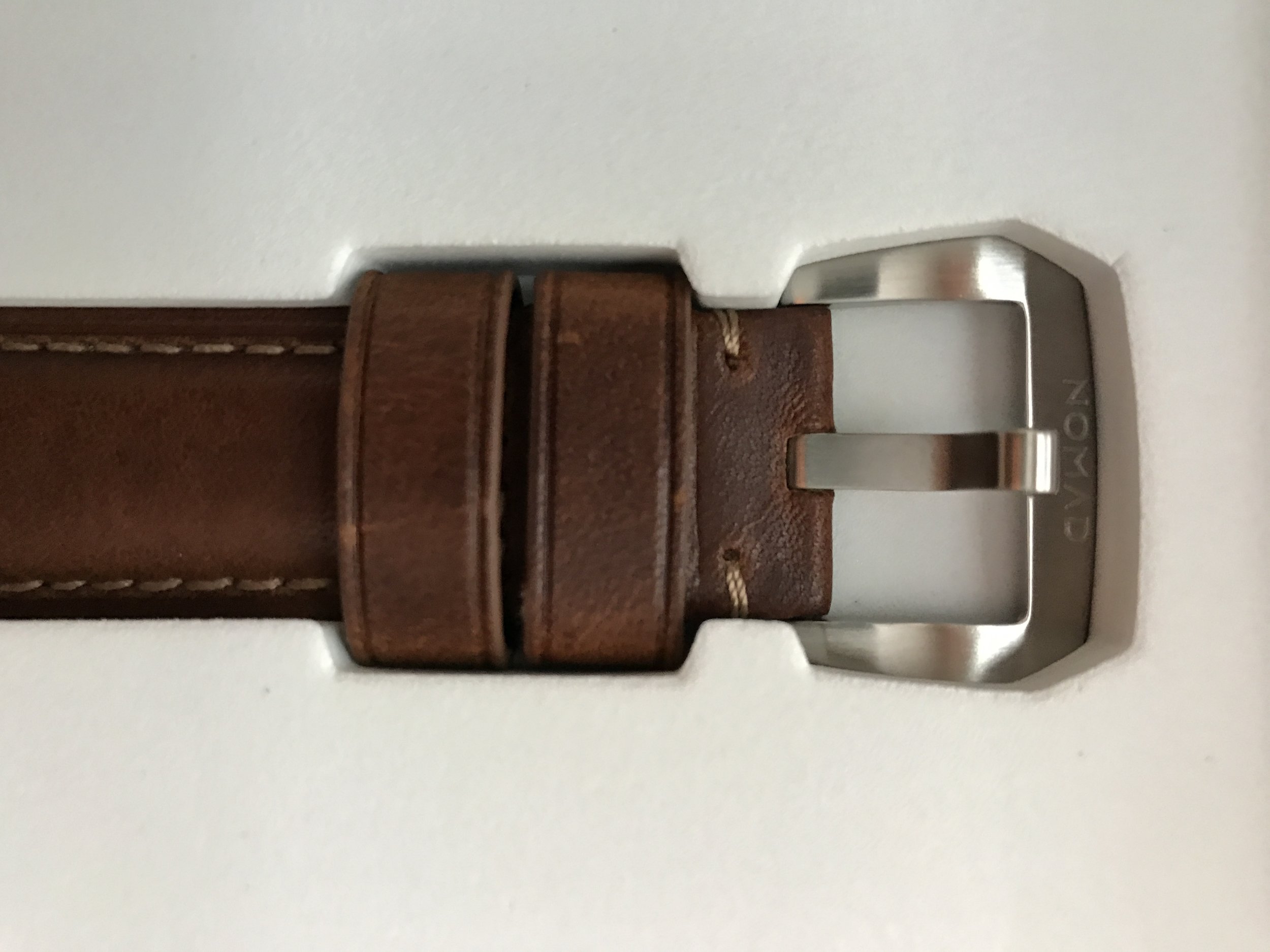
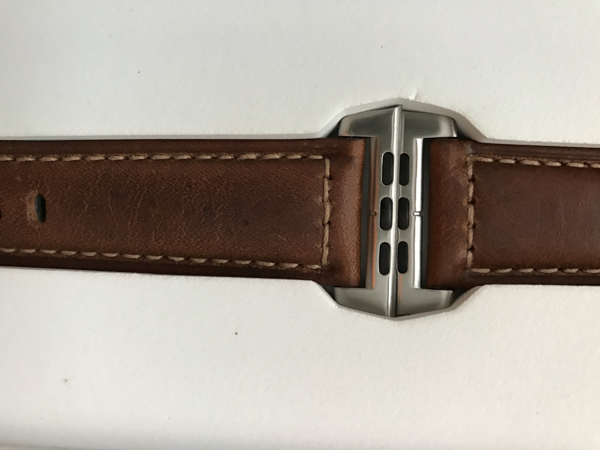
Apple Watch 7 Initial Reviews and Thoughts

Yesterday all the early reviews dropped on the Apple Watch Series 7. My favorites were from TechCrunch, John Gruber, and Marques Brownlee. One theme that seems to run throughout is that the Apple Watch Hardware is to a point where the changes are more iterative than revolutionary, which is probably good news. I’ll be upgrading my Series 5 to a Series 7, so I’m invested. I like the additional pixels and the brighter always-on display. To be honest, I am most looking forward to having a watch with a fresh battery. I wear my Apple Watch every day and use it aggressively. I’m now to the point I often need a mid-day charge to get to the end of the day.

To me, the obvious next step for the Apple Watch is more and better watch faces. I seem to repeatedly bounce between watch faces, none of which I am particularly excited about. At this point Apple has put way more creativity into watch bands than watch faces. I don’t need a new industrial design for the Apple Watch, but I sure would like some more face options.

Personalize Your Apple Watch with the Watchsmith Update

Before there was the sensation that is Widgetsmith, there was Watchsmith. If you're an Apple Watch user, then you know that the device is a lot more than just a watch. It's also a highly customizable accessory. But what if you wanted to make it even more personal? That's where Watchsmith comes in. This newly updated app for your iPhone lets you customize your Apple Watch with a degree of control I have not seen from any other app.

Just like Apple left the Apple Watch with limited face options, it also left it with few complication options. Watchsmith fixes that. It starts with a comprehensive collection of highly customizable complications, ranging in function from date to weather. You can adjust each complication precisely how you want it and how that best suits your desired functionality or appearance while still retaining all the Apple Watch features and faces.

Watchsmith offers a pile of fully customizable complications ranging from today's date to surf conditions. You also have complete control over how they look, so you can make them just about any foreground and background color. One of my more functional but straightforward complications with Watchsmith is a big, easy-to-read date complication giving me today's date.

Version 2.0, the newest version of Watchsmith, ups the game a bit. Among the new features:

  • All of the complications have been updated to take advantage of the latest watchOS capabilities, which will lead to better performance and behavior when used in tinted watch faces.

  • A variety of new complication styles:
    - Photo
    - 24 Hour Dial
    - Modern Moonphase
    - Geometric Solar
    - Moon & Stars
    - Sun Timer
    - Solar Path
    - Golden Hour
    - Step Counting
    - Text Calendar

If you use the Apple Watch but aren't satisfied with your complications, this one's for you.

Five Years of the Apple Watch

Sparkys Apple Watch.png

Zach Hall is one of my favorite people covering the Apple Watch. He's heavily invested in the platform but objective enough to call balls and strikes against Apple. I enjoyed his recent retrospective post looking back at the Apple Watch from his initial review in 2015 until today. It's a great read.

As for me, the Apple Watch very quickly became a daily companion. I've historically worn watches, so putting one on never felt weird to me. The difference is that this watch delivers messages from my sweetheart, helps me stay in better shape, allows me to leave my phone in my pocket (or on the charger), and puts a digital tool chest on my wrist. It's felt like a 100% upgrade to me.

I have my list of gripes, and I'd certainly like Apple to let third parties make watch faces, but overall, I don't see myself stopping wearing my Apple Watch any time soon.

The Elusive Green Ring

When I first got my Apple Watch, I’d been using a FitBit for years and was very proud of my daily 10,000 steps. Immediately, however, I discovered that despite much walking, the green ring on my fancy new Apple Watch barely moved. Not only was I not hitting that target of 30 minutes of elevated heart rate a day, I realized I hadn’t even been aiming for that goal in all those years of wearing a FitBit.

So I made some changes, and now I spend time hiking up hills, riding my bike, and (until a few months ago) going to the gym to fill that elusive green ring. Even being stuck home, I’m finding ways to push myself and fill that green ring most days. I read some affirmation for this exercise this morning from cardiologist Brian Lima, who explains that when it comes to those Apple Watch rings, the green activity ring is one ring to rule them all.

Digging the Cellular Apple Watch

I’m on vacation this week (Aloha!) and as a result, spending a lot of my time doing things – like swimming in the ocean and jumping out of airplanes – that aren’t very friendly to iPhones.
This week I’ve come to appreciate the cellular radio in my Apple Watch. I initially bought it because I do lots of hikes and bike rides without a phone and wanted something that could give me a life-line “just in case”. It occurs to me this week, however, that the cellular Apple Watch is also useful if you just lead an active life.

With the cellular radio, I’ve been able to call my wife while snorkeling, text her from the plane right before I did my first skydive, and generally stay in contact with the rest of the world when otherwise I wouldn’t be able to.

While I still think the number one use case scenario for the cellular watch is for emergencies, I would add “a connection for an active life” as number two.

A Follow Up Point about Battery Life

Somewhat related, the series 5 Apple Watch started out with some significant battery issues that got better with recent software updates. However, using it to track extended ocean swims and hitting that cellular radio have been destroying my battery. With me starting most days at 7 AM, twice now I’ve had it go into low power mode by the end of the day. At this point, I’ve got a new habit that when I take an afternoon nap (it is a vacation after all), the watch goes on the charger.

The Physical and Fiscal Benefits of the Apple Watch

Apple’s new Close Your Rings website is a good message and an excellent way to sell the Apple Watch. While I’m not particularly excited about any app using game theory to push my buttons, for the Health app I'm willing to make an exception. I'm more aware of my activity since I started wearing the Apple Watch than I’d ever been before. It’s because of those rings that I bike most places, often wake up an hour early to go on a hike, and even occasionally find myself marching up and down the stairs in my house in the evening just to make sure I get those extra 10 minutes of elevated heart rate. Don’t believe me? Look below.

Not only does this help my physical health, it also helps Apple’s fiscal health. Several times I’ve told friends about how I use the Apple Watch to track fitness, and it often ends with them nodding approvingly while saying something like, “Hmmm”. Then the next time I see them following a birthday or big holiday, they are wearing their very own Apple Watch.

IMG_7C3FEA394FF5-1.jpeg

Getting the Most from the Siri Watch Face

Siri Watch Face.png

I have been using the Siri watch face with watchOS 4 as my primary watch face since iOS 11 shipped. Ordinarily, I am not a digital watch face guy. I grew up looking at analog watches and I’ve been primarily using those on the Apple Watch since it first arrived. Nevertheless, I like the idea of a smart watch face on the Apple Watch giving me more timely information, so I went in with the Siri watch face. Also, I spend a lot of time at the sharp end of the stick when it comes to Siri, so I had to give it a try.

The idea behind the Siri watch face is to contextually give users the information most relevant to them at the time. The face itself is the time with a few complications and a scrolling list of information boxes below that you can move throughout using the Digital Crown. Tapping on any of these boxes brings you into the source application. Tap on an event, for instance, and you go to the calendar app.

There are a lot of Apple applications acting as a data sources for the Siri watch face. Using the Apple Watch face you can get information as to when the sun will rise, the weather forecast, and upcoming appointments. It runs much deeper than that, however. Data sources can also include reminders, alarms, timers, the stopwatch, your wallet, workouts, meditation/breathing reminders, HomeKit notifications, what’s now playing on your media device, photos, and even news.

For the two complications, I use the one on the right to display the current date and the left one for OmniFocus.

IMG_3648.PNG

There are a lot of applications feeding data into the Siri watch face. One of the first things I did was customize that. If you go into the Apple Watch settings application on your iPhone and tap on your Siri watch face, you get a screen that gives you several options to turn these data sources on or off. I left most of them on but turned off photos, because pictures on that tiny screen don’t make sense to me, and news, which I found to be too much of a distraction.

I have had a few pleasant surprises using the Siri watch face. I like the way it displays upcoming appointments. They are easy-to-read, and they disappear automatically as the day goes on. Rotating the Digital Crown up gives you future Siri chosen events and spinning the opposite direction brings up prior entries and if you’ve played audio recently, the last playing audio. This gives you an easy way to restart podcast or music from your wrist.

I’ve often been tempted to add the timer and alarm complications to my analog faces, but that complication space is so valuable. With the Siri face timers, stopwatch, and alarms only appear when in use so I get them when I need them and only that. Finally, the now playing entries are great for getting back into whatever audio you played last.

Overall, the convenience of the Siri watch face is enough to get me to stick with it despite my preference for analog faces. I'm going to keep using it for the foreseeable future. If you are going to use it, take the time to go into the settings application and customize the data sources to your preference. 

My biggest wish for the Siri watch face is to see third-party applications get on that data source list. For instance, why can't I get upcoming OmniFocus deadlines or Carrot Weather reports? Hopefully, that comes with future iterations.

Apple Watch Series 3 Review and Thoughts

The Apple Watch series 3 reviews are starting to show up online. My favorites were from John Gruber and 9to5 Mac. There also appears to be some sort of bug with unauthenticated Wi-Fi networks but I expect that will get sorted out.

While Apple’s marketing is focused on the fact that the cellular Apple Watch makes telephone calls, I think the more relevant point for nerds is the always on Internet connection. Having your watch be able to use Siri, connect to the Internet, and otherwise interact with the world without having to first go through the middleman of your iPhone seems to be a significant benefit. All of this said, the cellular companies charging $120 a year for the connection seems pretty steep.

Road ID for Apple Watch

For people who are active or have special needs, Road ID is a great product and service. Road ID is a wearable doodad that lets emergency responders know who you are and who they should call. There is even an option that allows you to keep an online profile with lists of your medications, allergies, and more.

Best of all, they now support the Apple Watch. They’ve got several products that will work with Apple Watch bands. If you're active without identification or have a medical condition that you want to make sure first responders are aware of, check these out.

Apple Watch Success and Jim Hanks

Yesterday Strategy Analytics announced that it believes Apple shipped 3.5 million Apple Watches in Q1 2017, making it the global leader in wearables and displacing Fitbit. If true (Apple doesn’t publish its numbers for Apple Watch), it’s pretty remarkable.

The Apple Watch is at a significantly higher price point than a lot of its competitors (including Fitbit), which makes them selling the most units even more impressive. The Strategy Analytics report doesn’t cover profit but I'd speculate that Apple is leading on making money in wearables even more they are in unit sales. 

I have to say, however, that I'm not surprised. If you own an iPhone, the Apple Watch is an extremely useful (and expensive) accessory. Getting notifications on my wrist means my gigantic iPhone stays in my pocket a lot more often. There's also several other nice little delights for Apple Watch owners. Turn by turn directions (particularly when you are walking) are awesome. Being able to ask your wife if she needs more bananas while you're walking through the grocery store by just talking to your wrist is also pretty great. Overall, Apple has made a lot of progress with the Apple Watch with recent hardware and software updates and I've spoken with very few people who bought one and didn't end up using it every day. 

It always strikes me how people talk about Apple Watch success as if they are surprised. In some ways, the Apple Watch reminds me of Tom Hanks’ brother, Jim. He's a great guy. He does voiceover for Woody. But also, he's Tom Hanks’ brother and everybody always wants talks about Tom Hanks, not Jim.


World's Greatest Apple Watch Stand

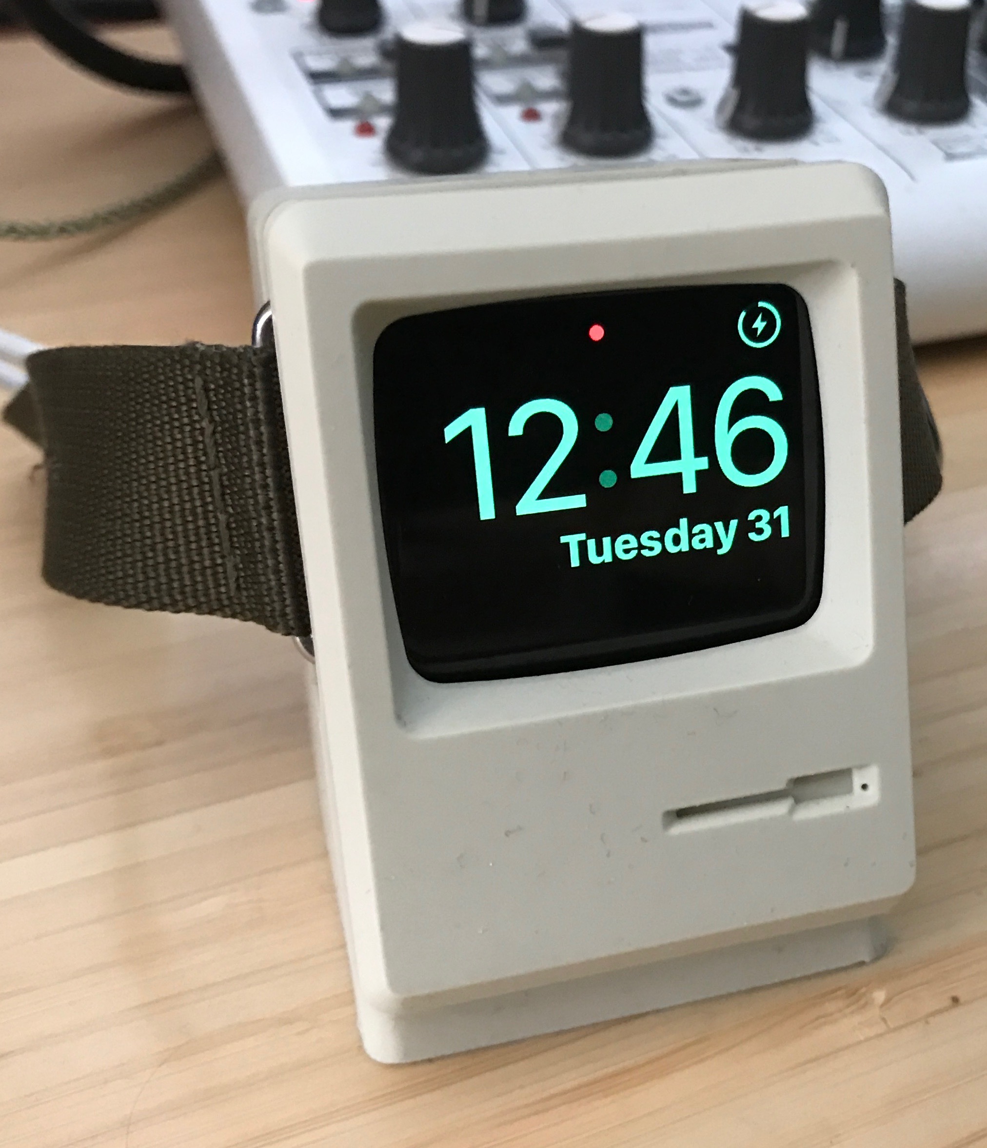
Despite being an Apple Watch fan, I'd never purchased a dock for it. Laying it on its side always seemed good enough for me. That was until I saw this little beauty, which I immediately bought from Amazon for $15. This may be a generational thing but it sure is nice having a classic Mac on my desk again, even if it is a lot smaller than the last one. (I particularly love how they got the little hole for a paper clip to force eject a floppy disk.)

You may be asking why I charge the watch on my desk as opposed to the nightstand. That's because I've been wearing the watch to bed as of late. The second edition watch is pretty great on battery life and charging it in this adorable stand while I work for an hour or two each day is plenty enough charge to get me through the day (and night).

Building Custom Apple Watch Faces

I mentioned in yesterday’s OmniGraffle sponsorship post that I made some cool new Star Wars Apple watch faces. That resulted in several emails from readers asking exactly how I did that. So here goes.

Custom Apple Watch Faces

Apple’s not big on custom watch faces. In fact, I would be surprised if they ever open the watch up for just anybody to make their own watch faces. Apple does, however, allow you to make a watch face based on your photo album. The idea is for Apple Watch owners to use their favorited photos on the background of a basic digital watch. If you love your dog, you can have your dog on your wrist every time you check the time.

I tested this watch face and didn’t like it because my favorited pictures (largely family pictures) don’t look good on a small screen and definitely don’t make a good background for a digital clock. That got me thinking about what would make a good background. Specifically, could I make something that approximates a custom Apple watch face so long as I’m willing to stick with the digital clock available on the built-in photo watch face? The answer is that it is absolutely possible to make interesting custom watch faces this way. The trick is to have a simple graphic and a pure black background.

Icons Are Key

As you may know, I love Star Wars. So I decided to make myself a series of Star Wars watch faces. Images shrunk down to a watch face size look pretty odd and anything with too much detail compresses into just a blob of pixels. Icons, however, are different. They are usually graphically fairly simple and can easily scale down to a small size for your watch face.

So I did a Google search for Star Wars icons. Specifically, the search was “Star Wars icons PNG”. It turns out there is a treasure trove of Star Wars icons on the Internet. Below is a more refined search of “Star Wars icons R2D2 PNG”.

A lot of icon files, particularly in the PNG format, are saved without a background making it really easy to drop them onto a black background to make your Apple watch face. To add a layer of difficulty for this tutorial, I picked this one that has a bright orange background. I then open the file in Preview and used the Instant Alpha feature to remove the background. It’s fairly simple. Just drag the mouse enough to remove the background and nothing more. When you’re done, save that file and then you’ll have a background-less PNG file of R2D2.

Removing the background in Preview.

Removing the background in Preview.

A Black Background

Next I needed to get that icon on a solid black background. This is the part where I use OmniGraffle. In OmniGraffle, I made a black square. Notice it is not gray or partially black. It’s solid black. When the watch face displays on Apple watch, anything other than black looks off. I tried using gray backgrounds and other colors and they all look silly because of the way the watch is made. A pure black watch face fades right into the background. If you look at Apple’s own watch faces you’ll note that almost all of them also use the pure black background.

Then I simply drag the R2D2 PNG file on top of black square in OmniGraffle. The photo watch face displays the time in the lower-right corner of the watch. Therefore, that section always needs to be solid black. (You can make an adjustment to display the time at the upper-right portion of the watch face if you prefer but I want the icons on top.) While respecting the area for the time display, you can set your icon anywhere else on the black square. I center larger icons and place smaller ones to the left but do whatever blows your hair back. Don’t make the icon too small. Don’t forget that watch face is still pretty small. Once I got things laid out exactly how I want in OmniGraffle, I export the images as PNG and then import it into the Photos application.

By default, the Apple Watch imports your favorited photos. However, in the Apple Watch preferences app on the iPhone, you can change that to import any album you choose. So I made a new album called, appropriately, “watch”. Now I have the Apple watch sync the watch album over instead of my favorites. I’ve loaded that album up with various bits of Star Wars themed custom faces I made in exactly the way I described above. It usually takes a few minutes but eventually the new images will sync over your watch and if you set the photo face as your default Apple watch face, you’ll suddenly find you got some nice custom watch faces. If you aren't feeling like makinig your R2D2 watch face but would rather just download mine, here you go.

Obviously, you don’t have to just use Star Wars icons. You could also simple icons from your interest (or fandom) of choice. The Internet is full of interesting, cleanly designed icons. Put any one of them on a solid black background and sync over to your watch and enjoy.

The Apple Watch Series 2

I've been putting my new Apple Watch Series 2 through its paces and thought it worth checking in on my initial thoughts.

Apple Watch Believer

I bought the original Apple Watch Sport when it first launched and I’ve worn it every day since. A lot of people lost interest in the Apple Watch in the months following its release but I find it quite useful. Every day I use the ability to see my next appointment on my wrist, the whole world of notifications, and the fitness tracking. I'd used smart watches before (like my original Kickstarter Pebble) and for me, the Apple Watch left them all in the dust. 

What I didn't like about the original Apple Watch was the performance constraints and, in hindsight, the quirky user interface. After getting excited about the changes with watchOS 3 and seeing that Apple added some new features (and performance horsepower) to the Series 2, I decided to upgrade.

The New Watch

While my original Apple Watch was the space gray aluminum, I upgraded with the new watch to Stainless Steel. This was a luxury but since I've already been wearing an Apple Watch for awhile, I know I'm sold and I wanted something nice.

The stainless steel watch is, not surprisingly a bit heavier than the aluminum watch but not uncomfortably so. The watch definitely feels more solid than the aluminum watch and I'm going to enjoy the new band combinations that I can get with the stainless steel. 

One concern with the stainless steel watch is the taptic engine. My friends that purchased the original stainless steel Apple Watch complain that the taptic engine doesn't work as well as it did on the Apple Watch Sport. What ever problem they had with the original stainless steel watch got fixed with the Series 2 watch. The taps work just fine and don't feel significantly different than they did on my original Apple Watch Sport.

Another difference I’ve noticed is the spin of their crown. It feels like it is slightly more weighted than with the lighter aluminum sport. I thought this was just in my mind but when I tried the aluminum and stainless steel watches in the Apple Store, I had the same impression.

Another benefit of the stainless steel watch over the aluminum is the material used on the face of the watch. The stainless steel watch uses Sapphire crystal and the aluminum watch uses Ion-X glass. The Sapphire crystal is tougher and comparing it to my year-and-a-half year old aluminum watch, looks noticeably better. I'm hard on watches and I'm hoping this new watch face holds up better.

The fit and finish of the stainless steel is great and while it hurt a little spending the extra money on it, I like the look of it a lot more than my original Apple Watch.

Performance Boon

My biggest gripe with the original Apple Watch was performance. While the original Apple Watch was a great productivity tool with the built-in basic features, I eventually gave up on all but the most rudimentary apps. Between the faster S2 processor and the improvements in watchOS 3, I find that is no longer the case. In attributing performance gains between the hardware and software upgrades I did not run any benchmarks but I can tell you that I ran watchOS 3 on my original Apple Watch for months and apps are snappier on the new hardware.

Apps actually work on this new watch. My OmniFocus database is a big one. Getting it over to my watch and navigating it on my wrist was unbearable with the original Apple Watch and now it can work. I still get occasional lags but they are fractions of a second. Since getting the new watch, I've never had an app show me the spinner and, ultimately, just quit on me like used to happen on the original Apple Watch.

The new processor and software now make it possible to use third party apps. Once you wrap your head around that, you'll need to start rethinking which apps may be worth the trouble. It's still an incredibly small screen and it takes pretty clever app developer to make it work. However, apps are now on the table and that is going to be interesting.

So Bright

The original Apple Watch has 450 nits of brightness. The new one has 1,000 nits. That's a lot of nits. In case you were wondering, a "nit" is a unit of luminance equal to one candela per square meter. I'm not going to entirely unpack that but I can tell you the brightness on the new watch is immediately apparent. So much so that I'm looking at the original Apple Watch screen and trying to get over how dim it now looks. 

While performance was the feature knew I wanted most in the new Apple Watch, screen brightness is the feature I did not know I wanted most. It's easier to read now, indoors and outdoors. If you are on the fence about upgrading your Apple Watch and want to save money, I recommend not comparing screen brightness between the old and new Apple Watches.

Water Resistance

I was pretty cavalier with the original Apple Watch and water. Because it was always on me, it often got pretty wet. I occasionally wore it in the shower, I'd wash it under the sink if it got dirty, and on more than one occasion my hand went into the water while wearing the watch. I feel even more reckless with the new watch. Water just isn't a consideration for me now. In addition to all the above, I'll be wearing the new watch in the pool and the ocean. 

GPS

With the GPS radio, you can now go for a run or a hike and leave your phone at home. The watch will track your route and show it to you once you get back to your phone.

The inclusion of a GPS radio on the new watch is great for runners but it also exposes a few flaws. It is still goofy trying to load music files onto the watch. If you regularly listen to temporary media (like podcasts and audio books), you're going to spend more time than you want getting data on the watch if you want to leave your phone at home on your next run or hike.

Recommendations

Granted it is early days but I really like the improved Apple Watch. If you didn’t get an original Apple Watch but have been thinking about it, now is an excellent time to get on board. The case for upgrading from the original Apple Watch is more difficult. If you are a swimmer or a runner (and want the GPS), you should definitely upgrade. The reason I upgraded is because I really like my Apple Watch and I wanted the latest and the greatest. The increased performance and screen brightness make the watch more useful to me. Now that I can actually use apps, I'm very curious to see how I'm using the Apple Watch in a few months.

watchOS 3 Brings Apple Watch 2

Last week while at WWDC, I loaded the iOS 10 beta onto one of my iPads. It's been a lot more stable than I expected it to be and this experience led me to do something a little crazy. I loaded the iOS beta on my iPhone. Usually (well …maybe always) it's a bad idea to load the first iteration of a beta operating system on that thing that you use every day to make money and pay your bills. However buoyed by the success on the iPad, I threw caution to the wind and did it anyway. This reckless act wasn't so much a result of any particular new feature I wanted on the phone so much as my desire to find out if the improvements to the Apple Watch are for real. So I did and they are.

For almost a week now, I've had my watch running watch OS 3.0. It's faster, more responsive, and I suddenly find myself using third-party applications again. I can attest that the improvements are not merely hypothetical but, if you give it a chance, can drastically change the way you use your Apple Watch.

I've now set up several watch faces that are task oriented. I have one for work, one for fitness, and one for home. The complications on each face are different and switching between them is a simple matter of swiping left or right on the current watch face. From these three watch faces I can get easy access to just about anything I need.

Likewise the watchOS Dock works swimmingly. I've pressed the physical button for the Dock more times in the last week than I did in the prior year when it was the Friends button. The background refresh of Dock-based apps is the killer feature here. I can actually now consider some third party apps that hold time sensitive data without worrying whether or not they'll be up-to-date.

I'm quite impressed with Apple's ability to go back to the drawing board and improve the user interface of the Apple Watch. I'm even more impressed, however, that they are squeezing this much better performance out of the exact same pokey hardware I had a week ago. I simply didn't think it was possible.

I've still got the occasional crash to deal with (it is, after all, beta software) but, once the bugs are ironed out and the software ships in the fall, a lot of people are going to be surprised at how perky their Apple Watch becomes.

The Apple Watch Nightstand

9to5 Mac recently had a nice post with some Apple Watch tips. For me, the winner is nightstand mode. It's not as well known as it should be but if you put your Apple Watch on its side on your night stand and connect the charging cable, the watch turns into a handy night stand. I've never liked bed stand clocks that light up the room at night and the Apple Watch kindly turns itself off. If you need to check the time, just touch the screen and it lights up for you long enough to tell the time and then goes dark again so you can go back to sleep. I also prefer the alarm sounds of the Apple Watch over the iPhone.


Checking in With Apple Watch

In a recent Mac Power Users episode, I recommended the Apple Watch as a year-end gift. This recommendation drew divided responses. Some wrote in agreement while others essentially asked me “is the Apple watch still a thing?”. Then out of the blue my wife asked me if she thought the Apple Watch was going to survive as a product. The question surprised me. My wife is, however, my window into the non-geek world and when she asked about the hypothetical Apple Watch demise, it made me wonder how many other people are thinking the same thing.

I think there is zero chance of Apple walking away from the watch. They view it as a key product moving toward the future and as technology gets better and smaller, the watch is going to improve dramatically.

Nevertheless, I’m generally bullish on my current Apple Watch. I wear it every day and use it to keep up with my fitness goals, set alarms and timers, check my calendar, listen to podcasts, turn on and off the lights, get directions, text my kids, and checkoff tasks. Oh yes … I also use it to tell time. This is the most useful watch I’ve ever owned. I put it on when I wake up in the morning and take it off when I go to bed. (That’s right, I even keep it on while I’m in my pajamas.)

Maybe it’s because there is this connection to the iPhone required to make it work or simply the fact that not many people wear watches and the Apple Watch was never going to be the big seller that the iPhone is, but there appears to be this perception that the product is flawed or not going to survive. I don’t think the product is perfect. The design, user interface, and software interaction can all use improvement. I expect there’s a group of people somewhere in Apple working on that right now.

I understand that some people did not take to their Apple Watch as I did. Maybe they wanted something more traditional or fashionable or maybe they just aren’t watch people. Nevertheless, having used one now since the Apple Watch was first released, I can’t imagine not having it. If something happened to my Apple watch, I would go buy another one.

Apple Watch Check In

I was putting on my Apple Watch this morning and thinking about how I’m using it now that I’m three months in. I’ve got several observations:

  • I still wear it every day. When I forget to put it on (rarely) I miss it.
  • The black rubber band is still just fine with me. I’ve worn it working in the yard and I’ve worn it at court and it doesn’t feel inappropriate in either place. I’ll probably buy an additional band at some point but right now I don’t feel any burning desire.
  • I was doing great with the fitness rings and then I got sick. The last three weeks or so I’ve been miserable with kidney stones. My fitness records went all to hell. I’m looking forward to getting those rings filled back up.
  • Battery life, shmattery life. I don’t even think about it. The watch always makes it through the day.
  • I also don’t think much about apps. Except for OmniFocus and Overcast, I’m not using any third party apps. I suspect that will change when we get watch OS 2.0.
  • I made this intricate set of watch faces when I first got the watch. I don’t use any of them except a minimalist version of Utility.
  • Notifications on my wrist is golden. I’m often in meetings but have many things going on. Keeping up by glancing at my wrist is unobtrusive and handy.
  • I find that I keep my phone in my pocket a lot more now that I’ve got the watch.
  • I already wrote about watch directions. All of that is still true.
  • Overall, my initial impressions haven’t changed. The Apple Watch, while not being essential, makes life for iPhone users a lot better.

Directions On My Wrist

As you can probably tell from all the recent travel-related posts, I'm on the road a lot as of late. One of the nicest surprises for me with the Apple Watch in my travels is walking directions on the Apple Watch. 

I've always felt like walking around with my phone out for directions was like painting a sign over my head that says "I'm a lost tourist. Please come mug me." This was particularly true in San Francisco as I walked around at all hours of the day.

The Apple Watch removes that. Once you set a destination on your phone (or on your Watch via Siri), you can put your phone in your pocket and not look so obvious. Your directions will then begin showing up on your wrist. 

The screen shows your estimated time of arrival and distance to your next turn. It's really quite nice. It gets better though.

As you are walking down the street, Apple Watch talks to you in secret code. If you are coming up on a right turn, you get a steady stream of 12 taps on your wrist. If you need to turn left you get three series of two taps to turn left. If you aren't sure, just look at your watch like you are checking the time when, in reality, you are getting directions like a secret agent in cold-war Berlin.

Once you arrive at your destination the watch vibrates again. Force tap your screen to stop the directions. Having done this now for several weeks, I can't imagine going back to getting walking direction on my phone.