Carrot: Weather with Attitude

Growing up in southern California, I never thought much about weather. It's always kind of nice and occasionally too hot but never too humid. But these days things are getting weird here and it has stopped raining. Not only do I care more about weather these days, I am carrying this underlying animosity towards it. 

With this in mind, I've found my perfect weather app, CARROT weather (iOS App Store) (Mac App Store). Carrot has timely and accurate weather data. It has more data than I certainly can use including things like humidity, pressure, dew point, and other things I don't particularly care about (or even understand). It also has solid weather predictions including temperature, how cloudy it will be, and wind speeds. If you pay an extra $1.99, it will predict and tell you when it's going to rain. (Snort.)

Best of all though is that the app has a sense of humor. It's kind of malicious but since that matches my own attitudes toward weather, it's perfect. When you open it up, it's voice will say something snarky about the current weather.

IMG_0153.PNG

There is a lot more whimsy throughout Carrot weather. For instance, there is a circle, dubbed the "ocular sensor", that serves no purpose. If you tap it, the application takes offense for you poking it in the eye and then says something appropriately rude to you.

The app also has weather for your current location or any other place you ask it to track weather. Some of the locations are pretty exotic, like Mount Doom and the Skywalker moisture farm. 

There are notifications, a today view widget, and all the other bells and whistles you'd expect. They have an app for iOS and also the Mac. While all this attitude is not necessary, I smile at least once a day when checking weather and in the middle of the California drought, that's pretty special.

A Few Notes about OS X El Capitan

It’s update day! Hooray! My usual sickness for installing beta operating systems long before any sane person would carried over to this year’s OS X update, 10.11 El Capitan. After several months, here is my collected list of notes, tips, and observations:

  • The new San Francisco font = win. I suspect this will be the Mac’s system font for a long time into the future.

  • Find friends in the today view sidebar is great. While working at my Mac I can get location data for my wife and kids immediately. I use it way more now that it is on my Mac than when this was an iOS-only thing.

  • Split view on the Mac is a great idea but the implementation feels wonky. Setting it up requires some precise clicking and dragging on the green minimize button. Swapping windows is harder than it should be. I like the idea but am not sold.

  • OS X Dictation got a performance bump. It is more accurate than the Yosemite version but also still makes some dumb mistakes and not as good as Dragon Dictate. (I’ll be writing more on that soon.)

  • That problem where some random-yet-unknown Safari tab is playing music is now solved. Safari puts a small speaker icon in the tab and never again will you be required to quit Safari because you can’t figure out which tab is playing the whack-a-mole song.

  • Swiping email to delete, trash, or archive is nice. It is not as useful as it is on iOS since we have keyboards on Macs but is a nice alternative. The only curious part is that aren’t as many swipe options on the Mac as there are on iOS, where you can also flag and move messages. It’s just weird that they didn’t didn’t include the same options.

  • Speaking of mail, data detectors are way better now. Apple Mail even gives you a little bar across the top of any message that includes usable data.

  • I’m going to write more about Notes but if you’ve been waiting, now is the time to push the button on updating your Notes database to the new Notes. Go ahead. Kick the tires.

  • Some of my nerd-friends aren’t impressed with the way Safari pins tabs. I like it. There are a few key sites that I like quick access to and pinning them does the job nicely.

  • Spotlight is getting Siri-like, by letting you type in natural language queries. (No Siri-type voice recognition this year.) Like all natural language interfaces, it works so long as you use the expected syntax. I like that the operating system is going this direction but consider it more a first step than anything else. Also, you can now move the Spotlight window.

  • There is system preference (in the General settings) to hide the menu bar. It may make sense if you’ve got a small screen. I tried it for a few days and it made me nuts. Apparently I still use the menu bar lots.

  • Metal means better graphics performance. While that is great for gamers, it also helps speed up slower Macs. Win-win. 

  • Two factor authentication is now part of the operating system. That’s a good thing.

  • Disk Utility got a new user interface. I never saw that coming.

  • One of my big complaints about Photos was the lack of third party extensions. That’s fixed now. Expect several Mac apps to get friendly with Photos now.

To learn more about El Capitan, we did an entire show on it with this week on the Mac Power Users.

Billings Pro 2 for iOS

Marketcircle has updated Billings Pro for iOS (Website) (App Store). The new version adds iPad multitasking. When I saw the screenshot, I was immediately taken with the update. This is exactly the kind of implementation I was hoping for with iPad multitasking. Adding billing entries while working in a browser or calendar makes so much sense to me. We are on the verge of significantly improved iPad productivity. I can feel it in my bones.


5 Quick Tips to Make Sure Your Presentation Doesn’t Suck

I recently was asked to give a presentation on how to make a presentation. I tried to keep it simple and came down to these five points:

1. Never Turn Your Back to the Audience

It can be scary standing up in front of a group of people. Turning your back gives you a way to hide and read your slides instead of engaging. That’s really bad. Audiences hate it and you’re better than that. No matter how tempting, when you first stand up in front of a room full of people, don’t turn around.

2. Use Fewer Words

It is easy to just transcribe your anticipated speech onto your slides. That doesn’t help you out. It just tells the audience that you don’t really care and they can ignore you. Don’t do that. You are a unique and special snowflake. Make the presentation support you, not the opposite. Also, if you’re going to use bullets, animate them so they just reveal one point at a time. That way people aren't reading ahead when you’re speaking.

3. Turn Down the Sexy

 Fancy animations and transitions can serve a purpose if used sparingly. If used often, they just become distracting noise.

4. Use Visuals

Humans are visual creatures and learn a great deal from what they see. A good presentation can pour understanding into the brains of your audience. Use images and visuals to enhance your words. Pooping a bunch of words on your slides while you are still speaking makes it impossible for the audience to both read the slide words and listen to your words simultaneously. Visuals, on the other hand, reinforce your words and can make all of the difference.

5. Tell a Story

The best presentations and speeches tell a story. They relate to the audience and bring your point (whatever it may be) into a context that the audience can share with you. When planning an important presentation think about that in advance. Plan the high points and low points to create a yarn that will pull your audience right along with you. At the end, they will love you for it.

Want to learn more? I know of a pretty good book.

Bartender 2

There once was a dark time for all Mac users where the menubar threatened to take over our computers. The march of applications with handy menubar icons seemed unstoppable while at the same time Apple started making laptop screens smaller and smaller. I remember having menubar icons that disappeared under application menus never to be heard from again.

Then came Bartender. Bartender seemed to bend the laws of physics, letting you move and adjust your menubar icons. Just hold down the Command key and start re-organizing your menubar to your preference. This even works on those sacrosanct Apple menubar icons like Airport and Battery Life. 

Moreover, Bartender gives you the ability to add a second list of less important icons that you can access with a single mouse click. It’s like putting menubar icons in a drawer that you can open at any time. Bartender even has a preference that allows you to elevate certain menubar icons out of its drawer and into the primary menubar whenever they are active.

I don’t know a single nerd that does not love Bartender. It gives you the freedom to add menubar icons to your Mac with reckless abandon while at the same time keeping your menubar clear and clean.

Today sees the release of Bartender 2. Like its predecessor, Bartender 2 adds a secondary menubar to your Mac where you can pile on the menu bar icons to be shown or hidden upon your request. I’ve been running the new version on my El Capitan test machine for a few weeks and it has some really nice improvements over the prior version:

Keyboard Navigation

You can now navigate your menubar via keyboard navigation. Bartender 2 lets you set a custom keyboard shortcut (I use Control-Option-Command-B) that opens up the Bartender menubar and highlights an icon. You can then use the arrow keys to navigate around the menubar icons both in the Bartender menubar and the primary menubar above. Once you find the one you want, hit the return key and you’re in business. This takes a lot longer to describe than to actually perform. If you like to keep your fingers on the keyboard, being able to get into the menubar with the keyboard combination is worth the price of admission alone.

Search

If your fixation with menubar icons is truly unhealthy, you may have so many that it is difficult to find the one you are looking for. Sadly, that’s been me. Bartender 2 fixes this problem by letting you search your menubar icons. To do so, start typing your search phrase when you’re in the Bartender menubar and the application does the rest for you.

New Paint and New Engine

With the imminent release of El Capitan, Bartender 2 also got many improvements to match the user interface direction that started with Yosemite and a lot of work went under the hood to add these new features while still working within Apple’s System Integrity Protection in El Capitan.

If you have ever faced any friction with managing your menubar icons, Bartender is the solution you’re looking for. With my 12 inch MacBook, I simply could not live without it. Bartender 2 is a paid upgrade. If you bought the original version, the upgrade is $7.50. If you’re buying a new, it is $15. You can learn more at the developer’s website.

24 Hours with the iPhone 6s Plus

I have now been officially using my new iPhone for 24 hours. I spent a lot of time peeking, poking and otherwise kicking the tires. Here are some initial thoughts:

6s vs. 6s Plus

There was much gnashing of teeth last year over whether to get the big one or the small one. I too was flummoxed. Never have I had so much trouble deciding between two products. Initially I bought the big one and then I traded it in for the little one. When the iBooks Store began supporting my iBooks Author books on the phone, I bought a used 6 Plus so I could test and make sure the books looked okay on it. I had intended to sell the used phone back but in the meantime my wife fell in love with my iPhone 6 and I found myself with little choice but to keep the 6 Plus. So last year I ended up spending eight months with the small phone and four months with the big phone. After all that time, I realize that there really isn’t that much difference. With the bigger phone, it’s a little more difficult to carry in your pocket and with the little phone you get slightly less battery life and the text is smaller. This time I didn’t sweat it. I just ordered the big one.

Buying Options

The new variable in the mix this year is exactly how you buy the new phone. Carriers are no longer interested in contracts and there are several options for purchase from a variety of sources. I’ve been happy with my service from AT&T throughout my iPhone ownership but at the same time I’m not all that eager to get in long-term relationships with them. So I decided to buy it from Apple. In that case I had two options: either buy it outright or buy it on on the Apple upgrade plan. Since the upgrade plan price was the same (I was going to add AppleCare plus regardless) I ended up on the Apple upgrade plan. This gives me the option to upgrade it next year if I want, although I probably won’t. (In my family I hand down the phone every year to one of my daughters.) So I bought a space gray 6s Plus with 128 GB. The storage size may raise some eyebrows but I put a lot of media, photos, and video on my phone and (in my mind at least) it’s cheaper to pay an extra hundred dollars to avoid screwing with storage allocation for the next year.

3D Touch

I’ve heard from several sources that Apple spent years perfecting this feature before adding it to the phone. That shows. It was remarkable to me how quickly peeking and poking became second nature. Using 3D Touch in mail seemed like a gimmick until I tried it. Now it is a “thing” for me. If I see a mail in my inbox and I’m not sure what it is, I peek at it. An interesting feature is the ability to apply the swipe gestures while peeking at an email. It depends on your settings but for me swiping to the left deletes the email and swiping to the right allows me to move it to a different mailbox.

3D touching app icons to get immediate access to specific features and makes performing common tasks in your favorite apps easier than ever. It’s the most significant addition to spring board since the arrival of folders. I’ve now put my camera back on my home screen because it’s so easy to hard press on it and then select whether I’m shooting a movie, selfie, or traditional photo. It’s definitely faster than opening the app and swiping around to the appropriate camera.

One more example of 3D touch that still make me giggle like a school-boy is on the iPhone keyboard. If you press it hard and start moving your finger around, it moves the cursor as if you are on a trackpad. Press just a little bit harder and begin selecting text. Do this once and you will never be able to go back to the old way of selecting text. (It’s going to kill me that I don’t have this on my iPad.)

Live Photos

Live photos are strange feature. I’ve taken a bunch of live photos at this point and while they are fun, I wonder if they are a novelty. I do, however, like the idea of looking back at some of these pictures in a few years to catch just a few seconds of my daughters being silly while I took their picture and wish I had something like this of them when they were younger. An interesting notes is that you can send live photos to other iPhones (I tested it with my daughters 5s) and they display with a long tap.

The implementation is a little spotty. When viewing a live photo with a hard press, the screen goes blurry and then start showing the video. The delay and blur feel pretty odd. Likewise, the quality of the images in the video are not particularly good. I found it hard to keep things in focus even while resting the phone on a stable surface while taking the live photo.

My wife, who is not a nerd, loves live photos and has been using it nonstop since she got her phone. I think it is her big thing with the new phone. That makes me wonder that maybe I’m reading this wrong and non-nerds will really embrace live photos. If they do, I hope they are doing so on something bigger than the 16 GB entry-level iPhones.

Touch ID

I’m more impressed than I expected to be with the new Touch ID speed. It is so fast that I barely see the lock screen. When I wanted to test a live photo as my lock screen wallpaper, I couldn’t get to the lock screen because Touch ID was unlocking the phone so quickly. Instead I had to use the sleep-wake button on the side.

The New Camera

Every year the iPhone camera gets iteratively better. With the big move from 8 to 12 megapixels this year, I feel a lot more comfortable taking wide shots with the knowledge that I can zoom in on them later without losing too much image integrity. The camera quality of the iPhone 6 was pretty good to begin with. Taking pictures outdoors with good light, I couldn’t see much difference between the iPhone 6 and the iPhone 6s. In low light however, the difference was noticeable. While the iPhone still is not going to replace your SLR or mirrorless camera, as a carry around camera, it’s pretty amazing. The below gallery shows some images I took last night at Disneyland with the new camera and some comparison shots with the iPhone 6 Plus camera. All images are not edited.

Comparison of the new front facing "selfie" camera isn't fair. The new camera is far superior with the 5 megapixel sensor. The screen-as-flash feature really works and doesn't make you look blown  out.

I did some tests for the amount of time it takes to take a photograph. I saw no noticeable difference between the 6 and 6s. However, the 3D Touch interface does let me get to the appropriate camera much faster than the old iPhone did.

Speed

Between the RAM (iPhone now has 2 gigabytes of RAM) and the A9 processor upgrades, the iPhone 6s is a screamer. I’ve only began to scratch the surface on this but I can already see that jumping through multiple tabs in Safari, downloading and updating a large OmniFocus database, and making alterations to photos are all noticeably snappier on the new phone. 

The most interesting story about the performance improvements for me is not what I can do today but what will happen tomorrow. With mobile devices approaching “desktop class” processing speeds, how much more awesome can app developers make the mobile devices. The powerful apps demonstrated by Adobe and Microsoft at the Apple event are just the tip of the iceberg. I expect in a couple years we are going to have a lot more “power” mobile apps available to us. 

There still are a lot of questions about how developers can create that market in the current “race to the bottom” pricing wars but there is no question the hardware and evolving touch interface can support a more advanced class of software. I can’t wait to see how this turns out.

Upgrade?

One of my daughters is currently rocking her iPhone 5S and doing just fine with it. Nevertheless, every year the iPhone evolves and gets a little better. This year’s iteration feels like it has evolved a bit more than iPhones in the past. If your current iPhone does not support 3D Touch, you’re missing out. That doesn’t mean you have to upgrade though. Using a three-year-old iPhone is perfectly adequate and fully supported by the current iOS 9 software. All that said, with their own upgrade plan, Apple has made it easier than ever to get into the new iPhone and I expect a lot of people will be doing just that.

Home Screen: Jazz Pianist Bob Karty

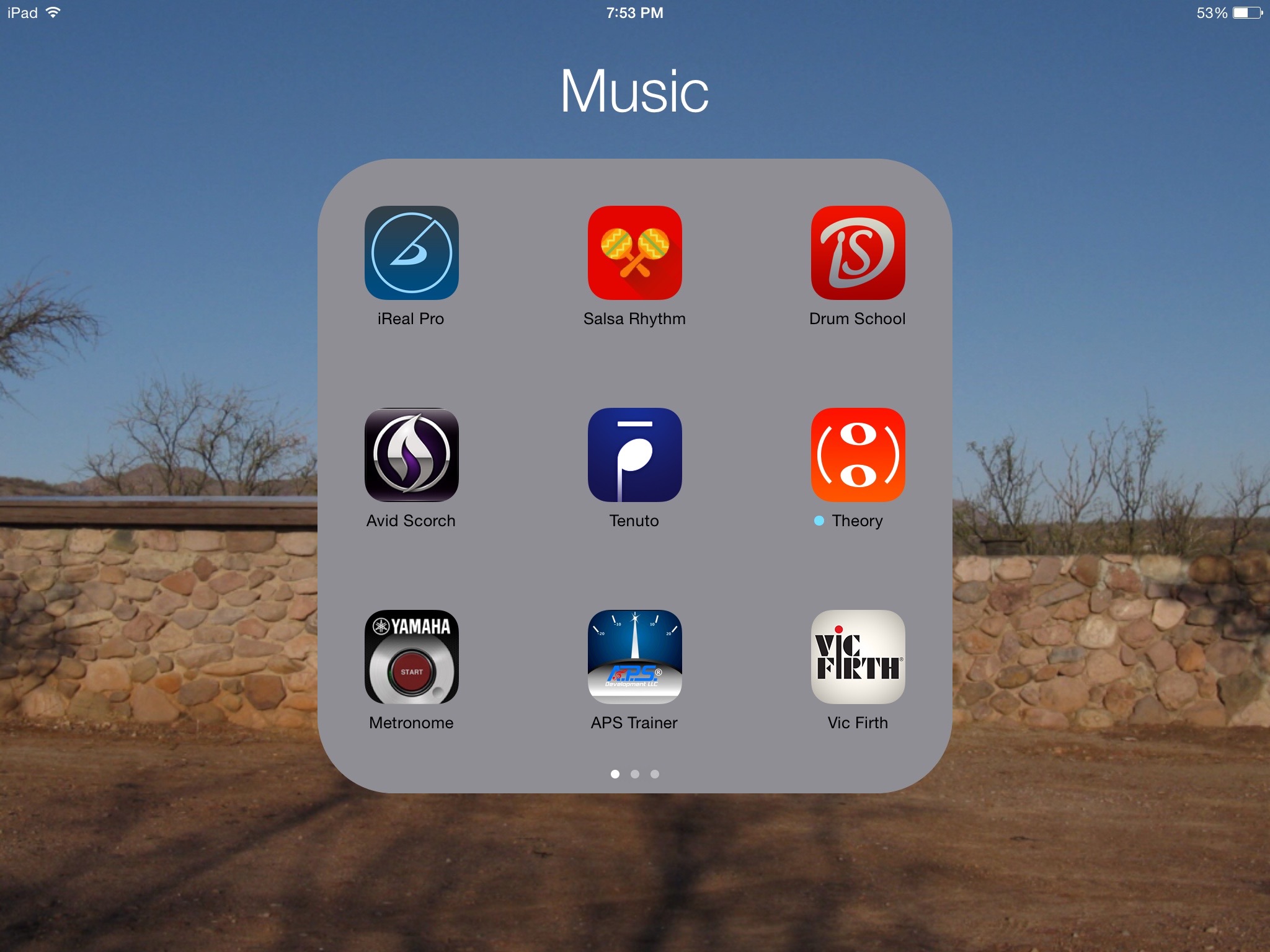
This week’s home screen features geek and jazz pianist Bob Karty (Website). I’ve been corresponding with Bob via email for some time. For years, Bob has been a sideman, playing with some of the best jazz acts in the San Francisco Bay area. Bob is now running this Kickstarter project to fund his own album and I thought it would be a great opportunity to look at Bob’s favorite music apps. So Bob, let’s see it.

I’m a professional jazz pianist and a music teacher, and I use my iPad a lot every day.

I use play-along tracks both for my own practicing and with my students. The tracks are in my iTunes library, which is stored on a Synology DS212j network drive. I play the tracks via Synology’s DS File app on my iPad, and the audio streams to a Marantz AV7005 pre-pro with built-in Air Play. It’s wonderful to have instant access to not only the play-alongs but my entire music library.

For casual listening, I use Synology’s DS Audio app.

If a play-along track is at a tempo that’s too fast for a student, or if they’re playing a song for which there’s no commercially-available play-along, I use an app called iReal Pro. iReal Pro consists of chord charts and a MIDI playback engine which reads the charts and plays them back using drums, bass, and piano or guitar sounds. You can instantly change a song’s key and tempo. The playback engine includes a mixer, so pianists turn off the piano track and practice along with bass and drums.

Most of the bands I work with have their own printed music charts of original songs. But if someone sits in and wants to sing a jazz standard I don’t know, the charts in iReal Pro come in handy.

In teaching Afro-Cuban/salsa/Latin jazz piano, I have students play along with rhythm accompaniment from an app called Salsa Rhythm. Originally designed for dancers, it’s very useful for musicians too. Pianists need to learn how to fit into the complex grooves in a very specific way, and this app is a great aid to that process.

Another app I use frequently is the Yamaha Metronome. There are many metronome apps, but this is my favorite - simple, straightforward, and accurate. You’d think a metronome would be accurate by definition, but I found one that wasn’t true, despite claims by the developer that it was “the most accurate” in the app store.

For students of music theory, I often recommend the Interval Ear Trainer module in an app called Tenuto. Tenuto contains drills and exercises for learning theory, while its companion app, Theory Lessons, covers the lessons. The Ear Trainer plays a musical interval, and you tap on the screen to identify it. It’s customizable to adapt to different skill levels, and students have a lot of fun with it.

A couple of brief mentions of clever and useful apps for audio engineers: Speaker Angle helps you set the toe-in angle of your monitor speakers, which helps improve the sound. Stereo Mic Tools uses the iPhone or iPad’s camera to help you position microphones in stereo recording configurations, which require precision positioning in order to capture the sound accurately.

Fantastical 2.1

I spent most of today with my head down on a calendar intensive project. That gave me a good opportunity to kick the tires on the newest version of Fantastical for Mac. Version 2.1 released yesterday and it’s the biggest update since they launched version 2. The new version supports OS X El Capitan, which will be landing on your Mac later this month. So far, my personal favorite new feature is the ability to cut, copy, and paste events and reminders. Quite often I have need to duplicate an event and being able to copy and paste an event with my keyboard is golden.

Navigation is also easier. You can scroll to a specific day or week using the trackpad and you can expand the scope in week and day view by pinching on the trackpad. Related, arrow keys can also now navigate the day, week, and month views.

There is a whole bunch more and you can read the release notes here. If you haven’t played much with Fantastical, I recommend watching my screencasts on the app. You’ll see why I use every day.

Microsoft Office for $150

Yesterday Microsoft announced that you can now purchase a license for Microsoft Office for Mac outright $150. There is no mystery to the fact that Microsoft prefers its customers move to the monthly plan rather than outright purchase. In that sense, this $150 version feels like a begrudging sale more than something that they actually want you to buy.

With the new $150 version you can only install the application on one Mac and it does not include access to the iOS versions. Purchasing Microsoft Office for Mac on a monthly basis is going to require an investment between $7 and $10 a month (depending on which version you buy). The gating issue is whether or not you have two macs or you want to use Microsoft office on your iPad. If the answer to either of those two questions is yes, you're going to need to purchase the subscription plan.

Somewhat related, Katie Floyd and I spent an hour and a half talking about the relative merits of competing word processors just this last weekend on Mac Power Users.

Saying “No” to the Master

Over the years I’ve got very adept at using the trackpad. The clincher for me was when Apple started introducing multitouch gestures. Whether I’m at my MacBook or iMac, as I go through the day I do flicks, swipes, and other gestures that make my computer dance for me. Once I mastered the built-in multitouch features, I downloaded Better Touch Tool and took the trackpad interface even further. At this point I’ve mastered the trackpad and using it feels a little bit more like playing the piano than a computer interface.

Nevertheless, I’m always interested in how things are going on the other side. Recently, I heard Myke Hurley talking about his brand-new Logitech MX Master mouse (Logitech) (Amazon). Myke loves it. With this mouse, Logitech has combined a weighty, ergonomic mouse with multiple buttons and inputs. Myke, for example, was able to drastically reduce the amount of time it takes him to edit a podcast using the programmable features of the MX Master.

This got me interested so I picked one up at the local Best Buy, keeping mindful of their two-week return policy. Myke was right. This is a remarkable mouse. It’s been years since I used a mouse and the ergonomics of the MX Master are better than any mouse I ever recall using. (They are definitely better than the Apple Magic mouse.) Likewise, just about every surface on this mouse has something you can press to make stuff happen on your Mac. In addition to the two buttons, there is a rolling wheel that can be switched between a ratcheting click or a flywheel inspired free roll. There’s also a separate scroller under your thumb and several additional buttons. The Logitech software loaded on my El Capitan Mac without breaking anything and the mouse performed without flaw for two weeks. I was able to program in many of the functions I pull off now with my trackpad using mouse buttons. The only real criticism I have is that it uses a USB dongle instead of natively pairing with the Mac through Bluetooth.

Nevertheless, I took it back. The problem was that I never truly warmed up to the mouse. If I had used it another month or two, the button layout probably would’ve become second nature just as the trackpad has for me. However, in my case, I’ve moved on. I am able to make a trackpad do a lot for me and it doesn’t move around the table, bumping into my glass of water or papers on my desk. Because I have my trackpad set up to click on tap (yes, I am one of those people), it requires virtually no force to click on my trackpad. Indeed as I go throughout the day, if one finger starts feeling a little stiff, I use a different finger for taps. While I was able to replicate many of the gestures I do with a trackpad on this super mouse, I was not able to replicate them all. Better Touch Tool gives you a seemingly infinite number of potential inputs on the trackpad. For instance, one of mine is to rest my third, fourth, and fifth fingers on the trackpad and tap with my index finger. Complex gesture like this simply are not possible with a mouse.

Finally, the biggest advantage of a mouse over a trackpad, more precise movement, didn’t really pay off for me. The mouse may have been slightly faster for some tasks, but I didn’t feel it or appreciate it enough to want to trade in my trackpad for mouse.

Now I know that some anarchists like to use both the trackpad and the mouse at the same time. If I were to go that route, I would just use an existing Magic mouse from a drawer rather than spend $100 on the souped up MX Master.

In summary, if you are mouse person, I’m not sure you could do any better than the MX Master. If you’re a trackpad person, you’re probably fine sticking to your guns.

Home Screen Post: Chelsea Cook

This week’s home screen features Chelsea Cook. Chelsea is an impressive young woman. She has a physics degree from Virginia Tech, has given her very own TED talk, and happens to be blind. Chelsea enjoys astronomy, reading, and creative writing. Her ultimate goal is to become an astronaut who writes poetry in space. Chelsea also loves her iPhone. So Chelsea, show us your home screen.

What are some of your favorite apps?

Wow, that’s hard, as I’m always downloading and trying out new ones. I like Downcast and ooTunes for audio, FlightView for tracking flights and gates at the airport (sometimes faster than the airlines and mitigates having to ask gate agents if you know the airport), and Check the Weather because it tells you the weather forecast so precisely without having to swipe through a bunch of information. It also includes “feels like” temperatures, which is important in the high humidity-environment of the east Coast.

Which app is your guilty pleasure?

Definitely iAssociate 2. The developer has made a great effort at making the game both VoiceOver-friendly and fun to play. I bounce back and forth between different games to help me get to sleep, (another one is 2048) but I always come back to this one. When I’m in the mood for something humorous, I’ll pop open the Cracked Reader

What app makes you most productive?

Sometimes it’s more the general features of the iPhone. When I got Siri, my productivity went way up, as it was just easier to add something to my calendar or make a reminder by voice than by typing. Siri helps in my homework as well by looking up astronomical conversions for me that I just put into a calculator as she reads them back. If I had to choose an app, though, I’d say… Mail. Before the iPhone, I was chained to my computer for email, and that was not very convenient for picking up things on the other side of campus. Now, I plan my day around my inbox in real time. Mail helps me manage the deluge, but also is a quick way for professors to communicate with me if they’ve gone out for coffee and I can’t read the note on the office door. I always hated carrying cash until I got the LookTel Money Reader; I didn’t want to carry around another device just to read bills, and this app is quick and accurate. My iPhone is with me all the time, so my currency reader is with me all the time, too. (I LOVE ApplePay for so many reasons, but the convenience and privacy can’t be beat anywhere else.)

What app do you know you’re underutilizing?

For sure: Workflow1Password, and blindSquare. Touch ID would probably make 1Password a whole lot easier to use. I like Workflow a lot, but have to be creative and spend some time actually thinking up things to do. And blindSquare is a multi-featured GPS solution that, combined with AppleMaps, has a lot of power and a lot of layers.

What is the app you are still missing?

The iPhone has opened up the world of apps so that as the device gets better, the apps get better; most of the specialized devices I used to carry around in a backpack now fit in my pocket. I still think the touch screen has huge potential to display mathematical content like matrices or graphs in a way that can be spatially understood by someone who is blind, similar to how you know where the icons on the home screen are. I know this is not an easy thing to code, but a VoiceOver-friendly graphing calculator or matrix manipulator would be awesome!

How many times a day do you use your iPhone/iPad?

Almost all the time. iOS is so powerful and has so much potential. I use my iPhone when I’m out and the iPad when I’m home or traveling, because of that long battery life. I love having a charged phone to get me to my destination after a long drive or flight. My poor MacBook air is usually relegated to the tasks of “heavy duty”, “long session”, or “needs hardware keyboard”. 

What Today View widgets are you using and why?

Today view is one of those underutilized features for me, because I don’t want it to get too cluttered. I mainly use Calendar and Dropbox, to see if events and assignments have appeared yet. I find the interface to be a bit clunky for some apps, and spend more time in there than I would like.

What is your favorite feature of the iPhone/iPad?

Easily the versatility of these devices. I’ve always hated carrying around many devices (worrying about charging them, losing them, not having the right one for the job), so have been firmly entrenched in that “one device to rule them all” camp. Need a GPS? iPhone. Book reader? all different books in one place on the 128 GB iPad. So for me, it’s not one feature, but all of them, nicely wrapped up in a single, shiny package.

If you were in charge at Apple, what would you add or change?

Another loaded question. I’d demolish and rework iTunes on the Mac—but that’s for another post. I wouldn’t sacrifice performance or features for thinness, particularly in some of their machines. An iPad or a laptop makes perfect sense to be thin and light; a desktop Mac does not. (Can you tell I miss the SuperDrive in the old iMacs?) I would also want desperately to fix the television interfaces, or at least unleash the content from cable providers, especially their audio-described content. I know there has been a general trend (in both blind and sighted communities) griping about apple’s software lacking in quality, and I am glad to see that they are addressing it, so hopefully my small software pain points and bugs will go away.

Do you have an Apple Watch? Show us your watch face tell us about it.
My AppleWatch is growing on me, as I figured it would. When I’m having fun or feeling geeky, I love showing off the astronomy face and entertaining questions about our universe. When I want to be practical the rest of the time, I find the Modular face for me to be a good balance of information, provided you choose your complications carefully. I can’t wait to really take the appleWatch for a walk in a big city and release the power of maps. Oh, and add “tactile way of telling the time!!!” to the Apple changes above. I love having access to Siri on my wrist for things like quick texts and cooking timers. This device has been a long time coming, and it can only get better.

What’s your wallpaper and why?

I changed it when iOS 8 dropped, so don’t exactly remember which is my home screen and which is my lock screen anymore, but I always put in the space or astronomy-themed wallpapers. Something to do with galaxies this time around.

Anything else you’d like to share?

When I say iOS devices have been life changing, I’m not understating that. I can go to a new city and navigate independently. I can take pictures of money and documents without having to ask someone to read them to me. I can use the Internet and apps to collect all kinds of information that was previously unavailable or very hard to find and I can connect to a community who really cares about interfaces and experiences. I believe all those things, and more about the iPhone. Thanks, David, for giving me this opportunity.

Oh, and if people want to find more about my work, they can watch a TEDX video of me playing with 3D math shapes.

Chelsea Cook is a physics major at Virginia tech. She enjoys astronomy, reading, and creative writing. Her ultimate goal is to become an astronaut who writes poetry in space. In her talk "Creating Interfaces, Creating Experiences," Chelsea will question how we handle problems and how we can solve them by taking another perspective.

New iCloud Storage Pricing

At last week's event, Apple announced new pricing for iCloud storage. You can now get a Terabyte for $9.99/month, which matches Dropbox. They have a lower tier at 200GB for $2.99 and 50GB for $0.99. There still is no method for family sharing, which means I'm currently paying for three people. I like that the pricing is now more in line with Dropbox and other cloud storage providers. I still think the 5GB free storage is not enough when we're buying expensive iPads and iPhones. You can see the international pricing here.

Right Pocket, Left Wrist

In a recent episode of The Talk Show, Ben Thompson talked to John Gruber about the problem with John’s watch disconnecting with his phone. Ben asked what pocket John keeps his iPhone in. This led to a discussion as to whether or not keeping your phone in the pocket opposite from your watch-bearing wrist causes a connection problem. As Ben explained, your body is a bag of water and by putting your wrist on the opposite side of your body from your phone, things get more difficult.

From personal experience I can confirm this is the case. I always carry my iPhone in my left pocket and wear my watch on my left wrist. I’ve never had any connection problems. Recently I had a pair of jeans with a hole in the left pocket. So for a few days I ended up carrying my phone in my right pocket. My watch disconnected from phone more times over those two days then I’ve had in the entire time I’ve owned the Apple Watch. If you’re carrying your phone in the opposite pocket from your wrist, you may want to rethink that strategy.